Colours, typography, assets, and usage rules for Pixel Rugby.
| Context | Font | Notes |
|---|---|---|
| Game canvas & HUD | Press Start 2P | All text uppercase. Loaded from /assets/PressStart2P.ttf |
| Buttons & labels | Press Start 2P | 8 – 18 px depending on button size |
| Website pages | System font stack | Body 16 px, line-height 1.5 |
| Code/mono | SFMono-Regular, Consolas, monospace | For code snippets and hex values |
In-game buttons follow a pixel-art aesthetic with chunky borders and a stamped block extrusion (solid dark-green #1e5f2a filled at every offset from 1 to depth) instead of a translucent drop shadow — matching the title, carousel, and card extrusions. Selected (primary) buttons also breathe with a subtle ~1.2% scale pulse to draw the eye. Extrusion depth scales up in portrait so the stamped look reads at touch sizes.
| Type | Size (P / D) | Border | Radius | Extrusion | Use |
|---|---|---|---|---|---|
| Action button (selected) | 400×80 / 178×38 | 3 px gold #FFD700 | 5 px | 4 px (5 px portrait) solid #1e5f2a | Selected / primary action (Kick Off, Continue, Play Round X) |
| Action button | 400×80 / 178×38 | 3 px white #fff | 5 px | 4 px (5 px portrait) solid #1e5f2a | Unselected action |
| Footer text button | 142×48 / 90×28 | 2 px white #fff | 3 px | 3 px (4 px portrait) solid #1e5f2a | Small secondary actions (< Back, Shuffle) |
| Footer icon button | 64×48 / 38×28 | 2 px white #fff | 3 px | 3 px (4 px portrait) solid #1e5f2a | Icon-only footer / homescreen actions (info, controller, trophy, gear, hamburger, users, fast-forward, sun/rain, pools) |
| Destructive button | varies (icon + label paired) | 2 px white #fff | 3 px | 3 px solid #7a0000 | Red #cc0000 face. Warning glyph prefixed to the label via drawDeleteButton(). Delete All Data, Clear, Delete Career. |
Side padding: SAFE_X + (p ? 20 : 10). Bottom margin: p ? 16 : 15. Adjacent footer icons share a p ? 14 : 10 px gap so they read as a uniform strip.
All glyphs are authored on a 24×24 pixel grid and rendered as Path2D fills (solid white over the button face, or solid #fff over a red face for destructive variants). Adding a new icon means adding a new _X_ICON_SVG + _drawXIcon(cx, cy, size) pair next to the others in game.js.
| Icon | Constant | Used by |
|---|---|---|
| Settings (gear) | _SETTINGS_ICON_SVG | Title-screen footer (gear button); WC / 6N / 4N tournament screens (in-tournament settings menu), their team-select carousels, and their mode-intro screens — opens the main Settings modal (trimmed to Difficulty / Sounds / Language) |
| About (i) | _ABOUT_ICON_SVG | Title-screen footer (info button) |
| Tutorial (TV) | _TUTORIAL_ICON_SVG | Title-screen footer (controller / TV button) |
| Trophy | _HIGH_SCORES_ICON_SVG | Title-screen footer; arcade carousel "best score" pill ([trophy] <score>); team-select / mode-intro Records shortcut (replaces the old "Results" text button) |
| Hamburger | _MENU_ICON_SVG | Career table footer — opens the Career menu modal; league select carousel and league mode-intro screens (foreshadowing the wider in-career menu) |
| Pools (grid) | _POOLS_ICON_SVG | Global Cup bracket footer — opens the all-pools view |
| Warning (! frame) | _WARNING_ICON_SVG | Prefixed to red destructive-button labels via drawDeleteButton() — Delete All Data, Clear, Delete Career |
| Users (My Team) | _USERS_ICON_SVG | Career table footer — opens the My Team customization modal. Also painted on every in-tournament screen (WC / 6N / 4N) left of the gear, opening the run-scoped tournament squad editor (same modal, in-memory edits that revert on exit) |
| Backspace (Clear) | _CLEAR_ICON_SVG | High Scores destructive Clear button (red face) |
| Fast-forward | _FORWARD_ICON_SVG | Match-intro footer — opens the Simulate-match confirm modal |
| Sun | _SUN_ICON_SVG | Match-intro weather toggle — clear conditions |
| Rain | _RAIN_ICON_SVG | Match-intro weather toggle — rainy conditions |
| Full Guide (book) | _FULL_GUIDE_ICON_SVG | About modal — link to /guide |
| Derby (crossed swords) | drawDerbyIcon() | Match-intro Derby banner |
Inside an icon button, the glyph is rendered at round(buttonH * 0.55) centered both axes.
Destructive or irreversible actions open a centered confirm overlay before committing. All confirm modals share the same chrome so the pattern is recognizable across modes.
| Property | Value |
|---|---|
| Backdrop | rgba(0,0,0,0.6) full-viewport fill |
| Panel | White card via drawPixelCard, radius:0, 2 px white border. Portrait VIEW_W − 60 × 180; desktop 300 × 140. |
| Title | Press Start 2P bold, 14 px portrait / 11 px desktop, #222 |
| Subline | 10 / 8 px #666 — short clarifier (e.g. "You will lose your progress.") |
| Buttons | Two side-by-side: destructive (default-state, red face for permanent wipes) on the left, primary Cancel on the right. 120×44 portrait / 90×30 desktop with a 12 / 8 px gap. |
| Keyboard | y / Enter / Space commits; any other key cancels. Modal absorbs all clicks/keys until dismissed. |
Examples: Exit Tournament (wcConfirmExit), Simulate Match? (simConfirmVisible), Clear High Scores (two-step: "Clear your <mode> history?" → "Are you sure? This cannot be undone." in red bold — applies to all tabs, not just Global Cup).
The "Match of the Day," "Derby," and venue banners on the match-intro screen sit on a white face with a 3 px (2 px desktop) solid #1e5f2a diagonal extrusion — no soft outline, no drop shadow. Banner text and the gold star / sword icon are also rendered in dark green #1e5f2a so the banner reads as a clean stamped block on the pitch.
Every Global Cup screen (pool view, all-pools, knockout bracket) renders the title bar via the drawWCHostBar(year, hostIdx) helper instead of drawBar. Composition: [host-flag] {YEAR} GLOBAL CUP centered, with the same stamped extrusion as a regular bar title. Flag height = round(fontSize × 1.15) portrait / −1 px on desktop so it visually matches the cap-height of the Press Start 2P glyphs; flag width preserves the standard 1.4:1 aspect. Falls back to a plain {YEAR} GLOBAL CUP bar when no host is set.
All career-mode modals (Career menu, History, Records, Rules, Sportsbook, My Team, Help, Club Info) use a uniform chrome:
rgba(0, 0, 0, 0.6)#000 diagonal block shadowThe Lite Icon is what /lite installs to a home screen: the face cut as a white-outlined sticker — rounded corners, the die-cut look — on the primary icon's own green, #369143. Same family, so the two builds are recognisably one game, but not the same tile twice when both are installed. Generated from the builder rather than drawn — scripts/gen-lite-icon.js calls the same Flyhalfie.build() the export does, so it cannot drift from the sticker this page offers below.
The Lite favicon is transparent and takes a black sticker outline where the Lite app icon takes white. That is the substrate talking, not an inconsistency: an outline exists to separate the sticker from what is behind it, and on the app icon that is a known green, while a transparent favicon lands on whatever chrome the browser has. Black is the only one of the three that survives a white tab bar and a dark one alike. Its corners stay square for the same kind of reason — at the 16px a tab actually renders, the border is about a pixel wide and rounding does not survive the downscale, while the sharp corners hold the silhouette's shape slightly better.
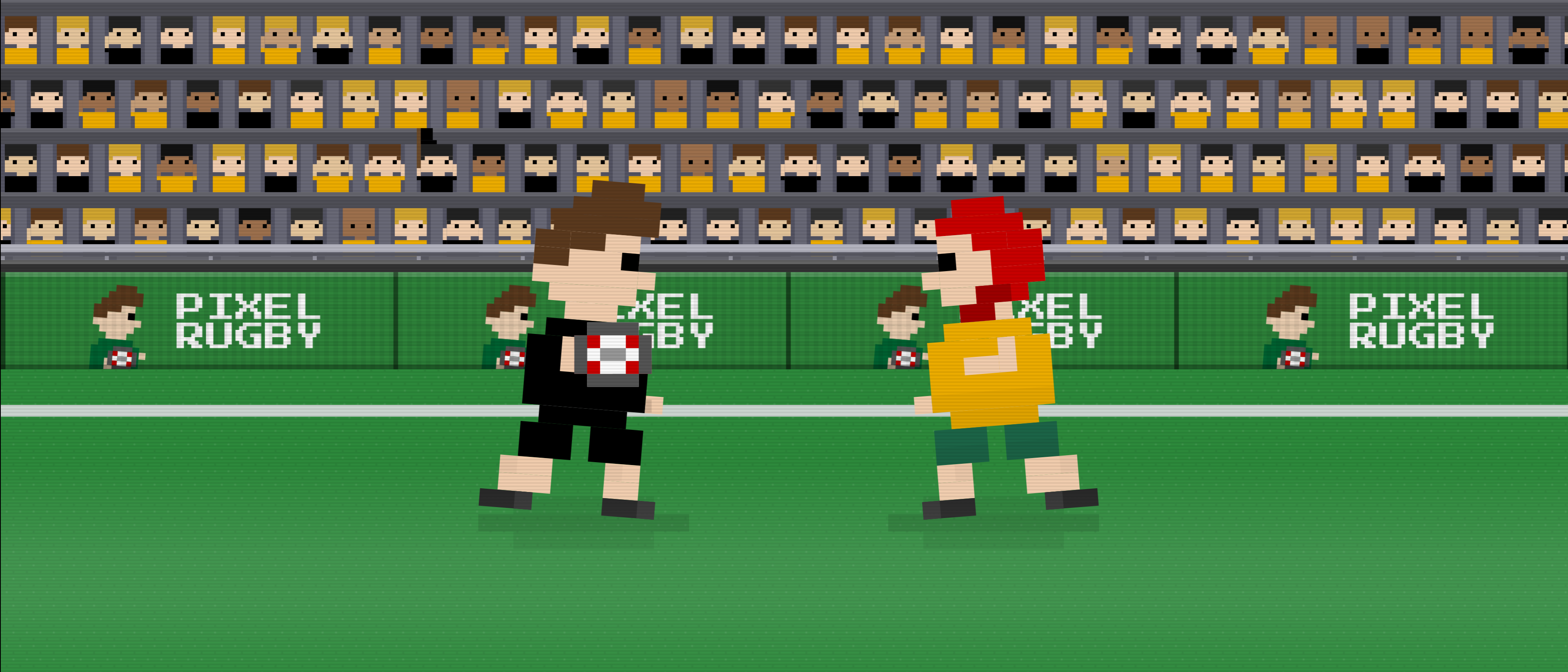
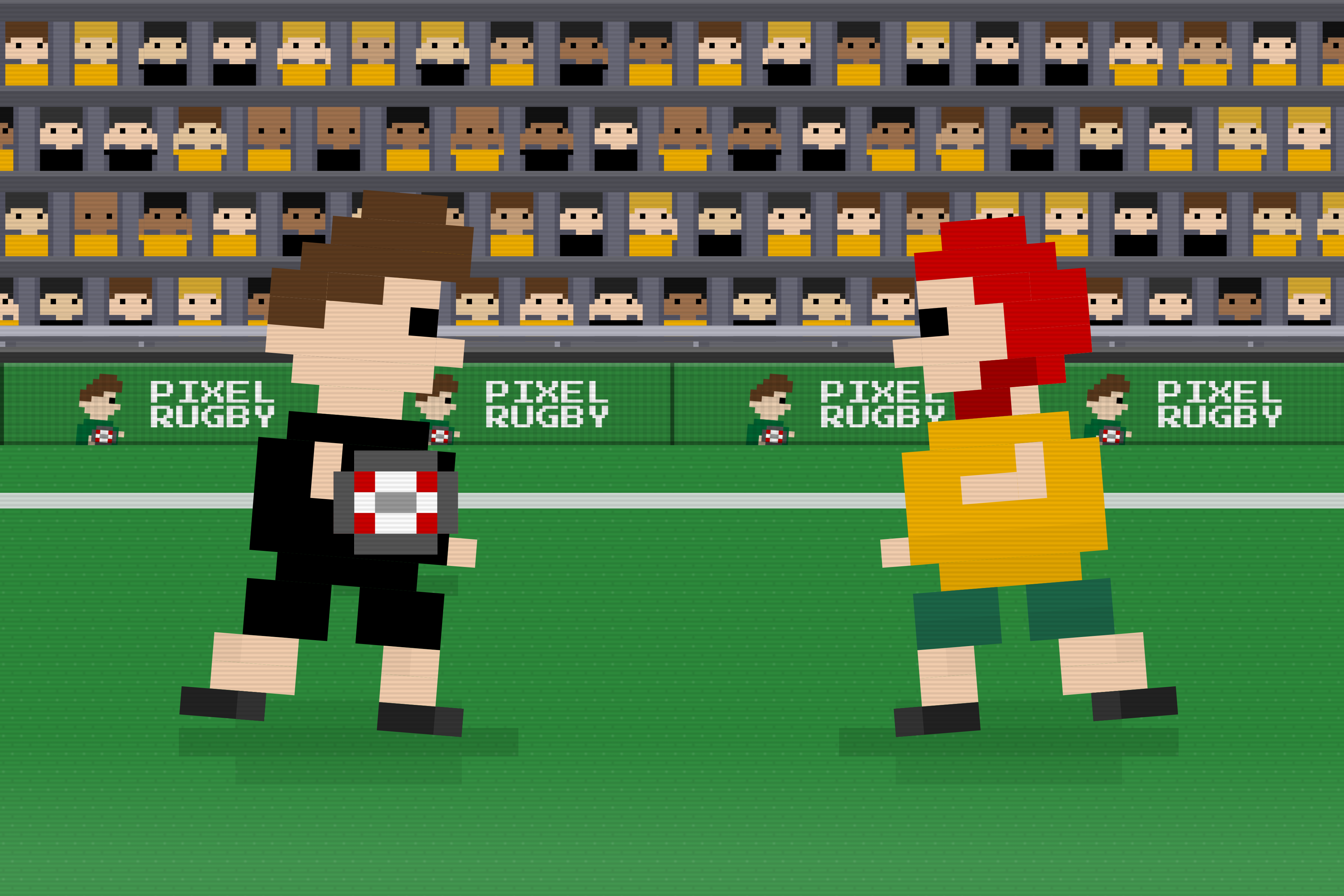
The App Store's creative assets, made 6 Oct 2026: New Zealand with the ball meeting Australia in a scrum cap, in front of a neutral crowd split between the two, with every board showing the logo so no slogan needs translating. The header keeps both players inside the middle of the frame because the iPhone shows only its centre column and the iPad only a wide band across it. The videos are seamless loops: the runners stride in place, half a step apart, and the crowd waves.
Start here for any kit. Every one of the 80 national and club kits, any hair style including the scrum cap, any hair and skin colour, with or without the ball — the builder draws it live and exports all six cuts as SVG and PNG, plus animated GIFs of the run cycle and of the mascot turning. This page used to carry a static card for each kit; the builder makes all of them and more, so the cuts below are just the canonical base artwork.
It also finishes them on the way out: a sticker outline in white or black, regular or thin, with square or rounded corners, any output size, a background baked in, and a square canvas. And it builds app icons — the framing apple-touch-icon.png uses, redrawn with whatever kit and appearance you picked, plus a store-ready set for the App Store, Google Play, Android adaptive layers and favicons.
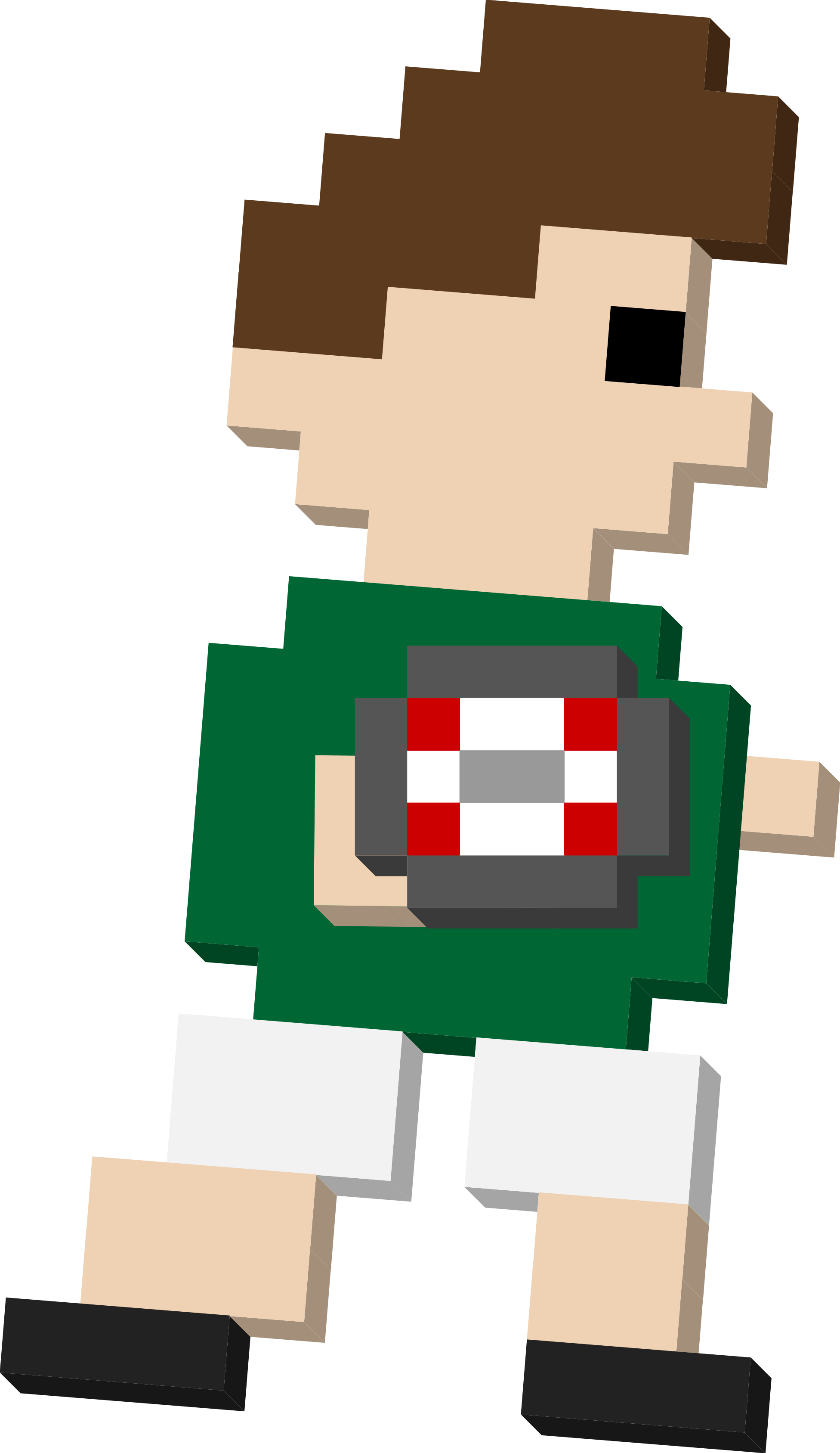
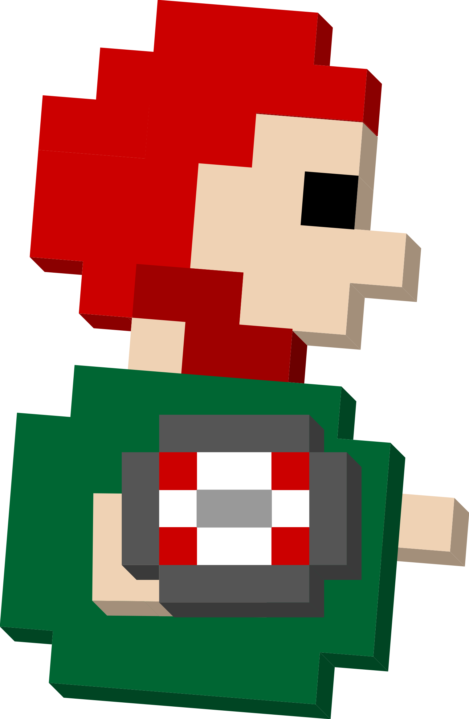
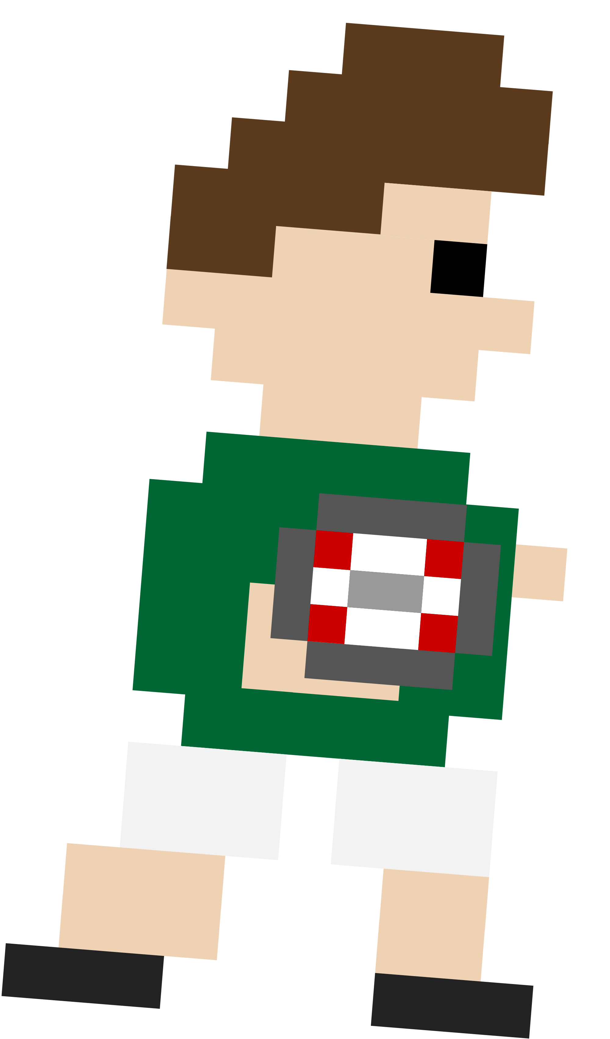
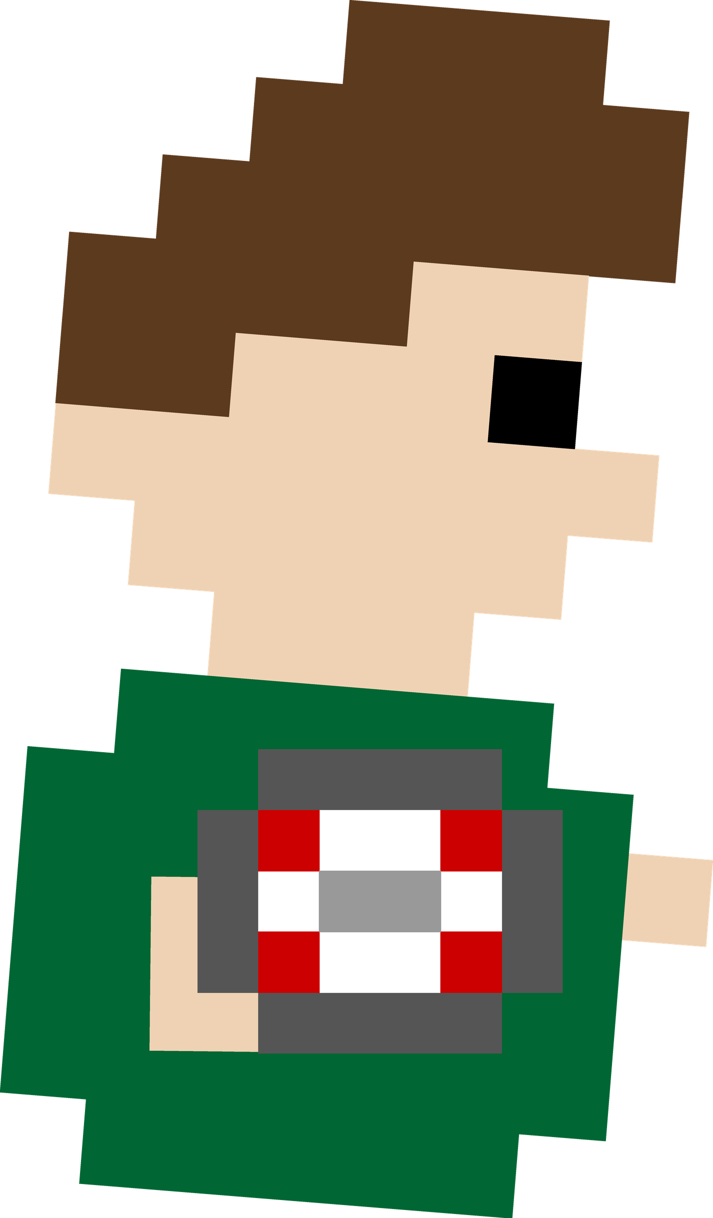
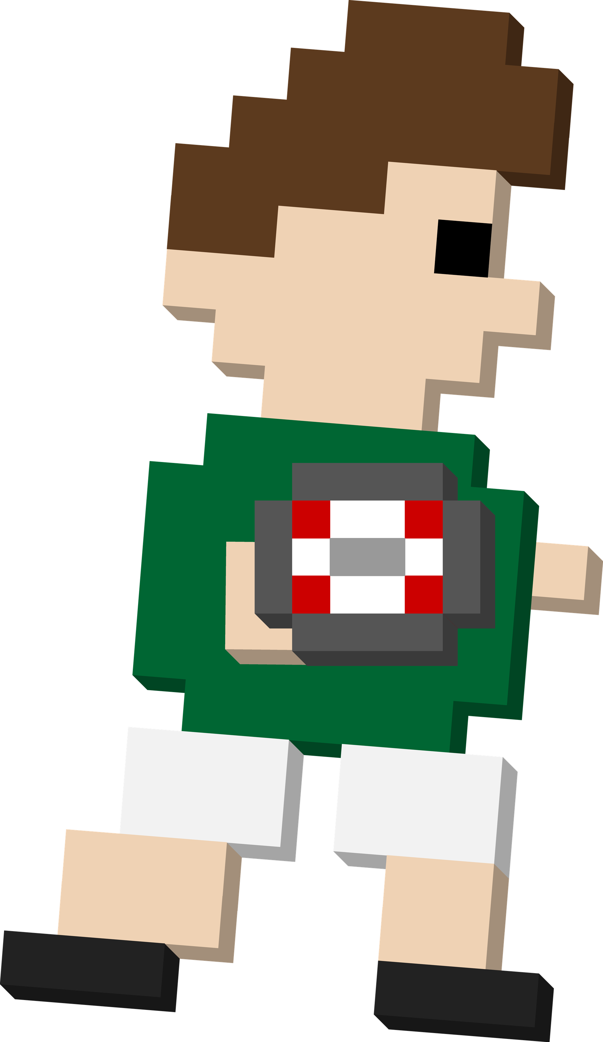
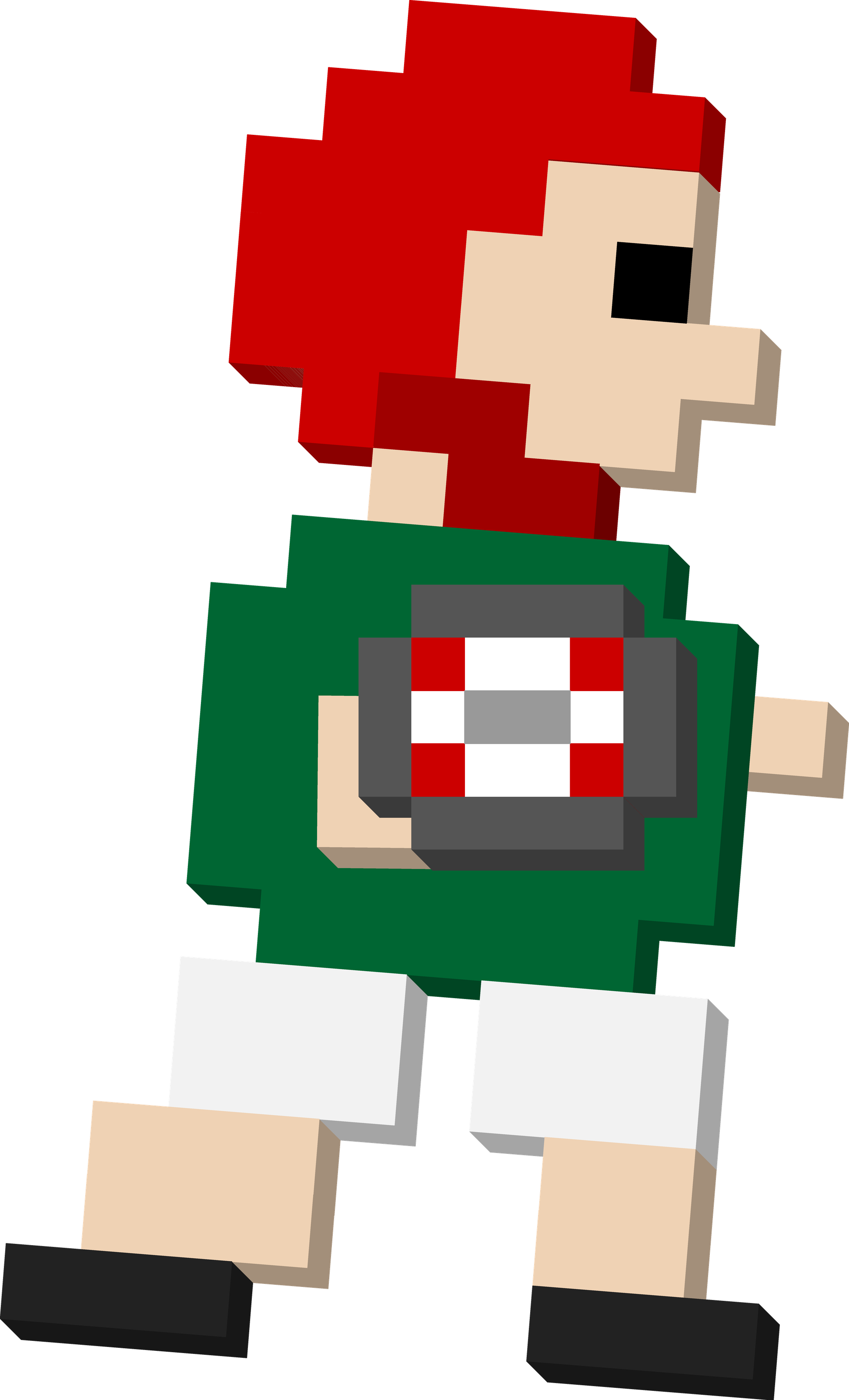
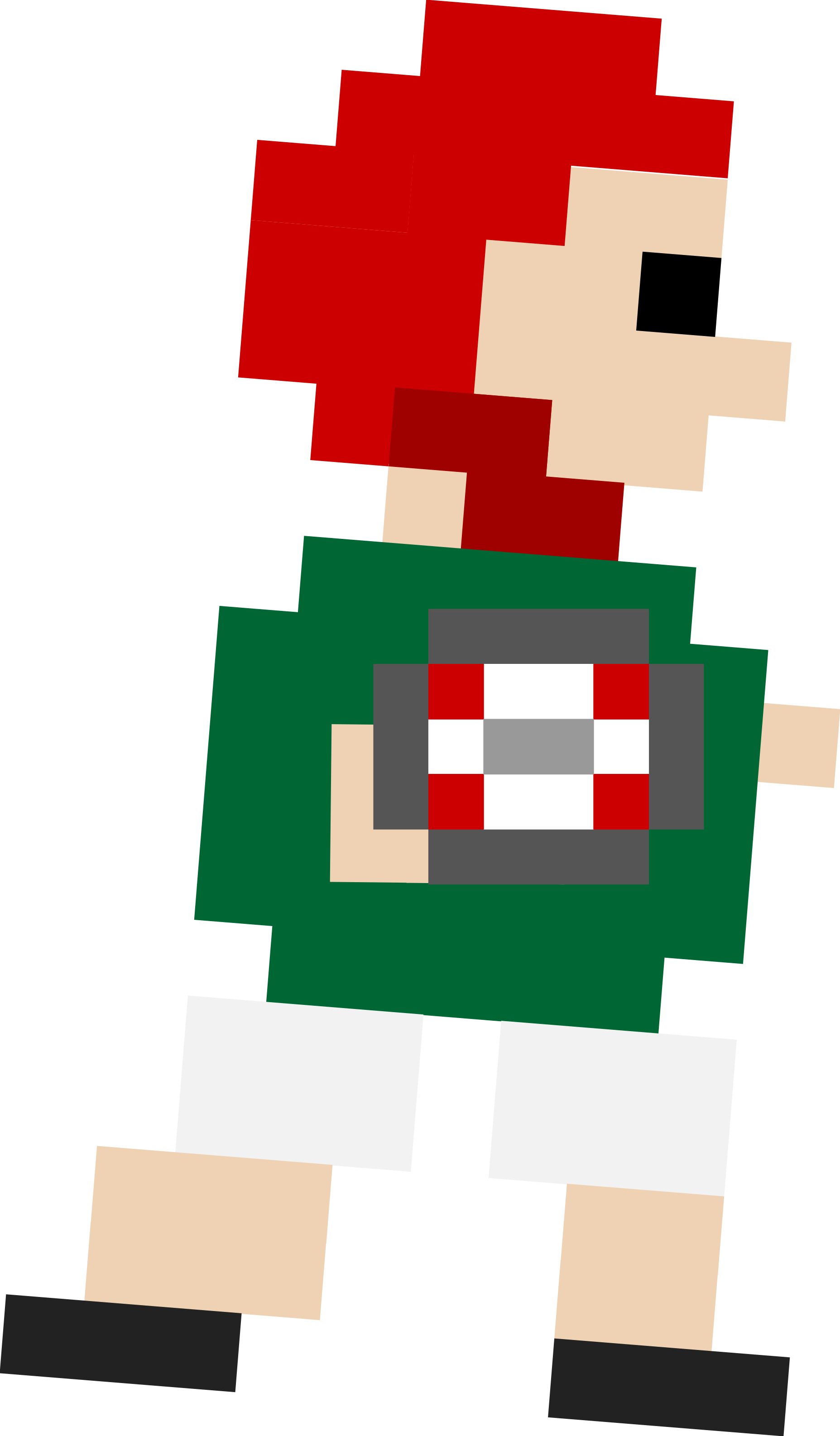
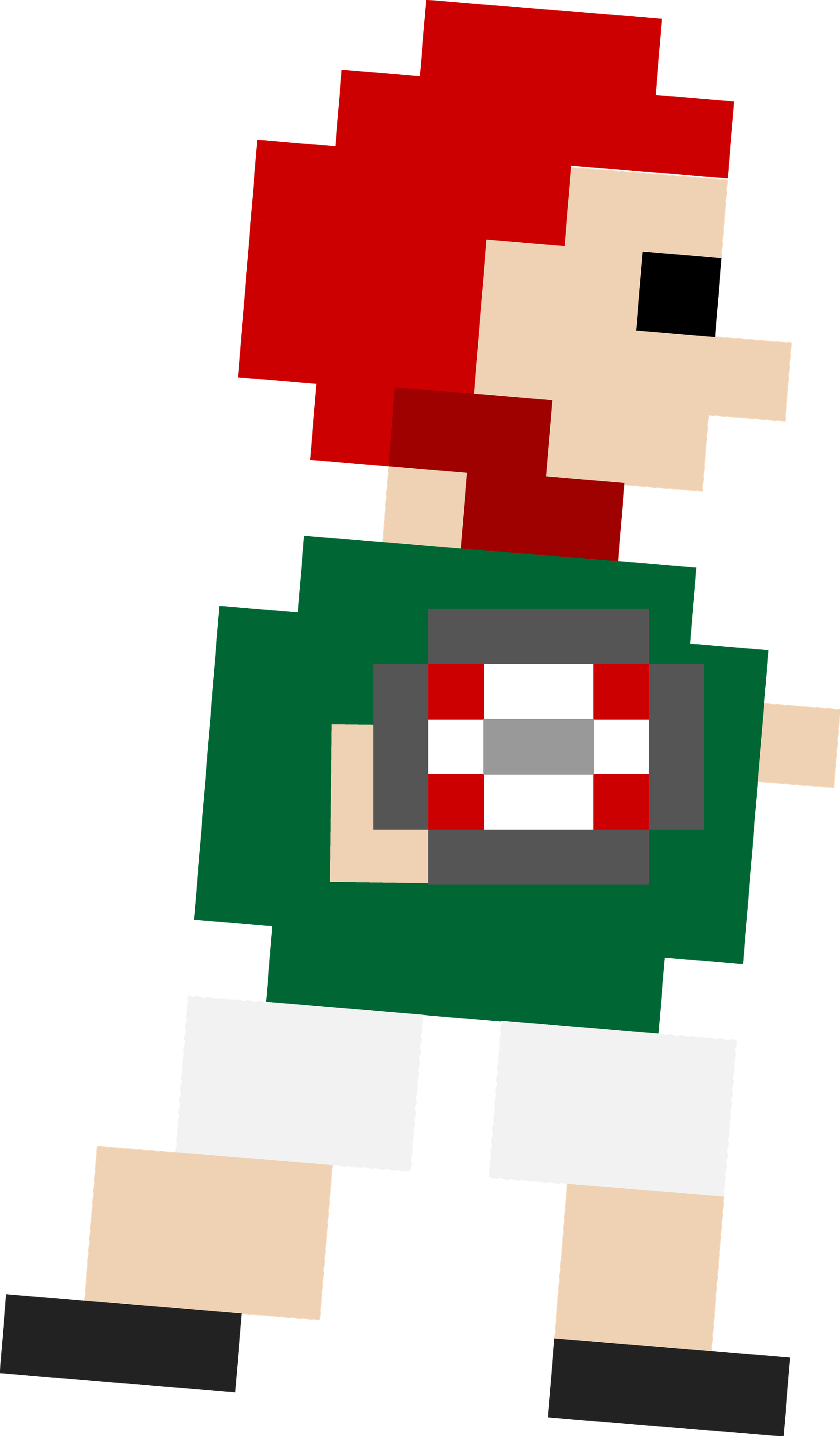
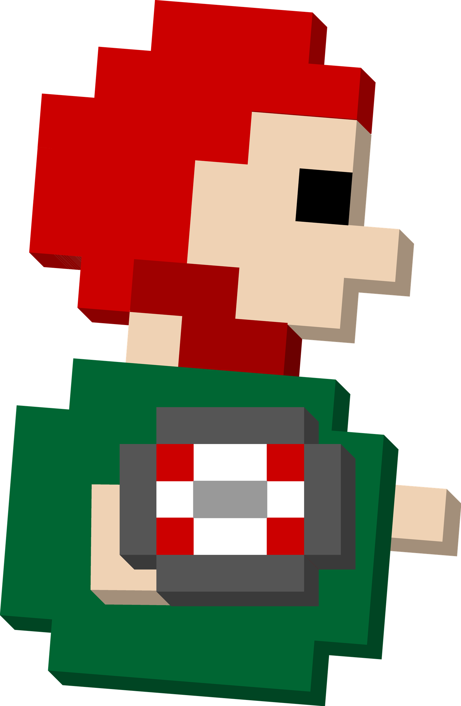
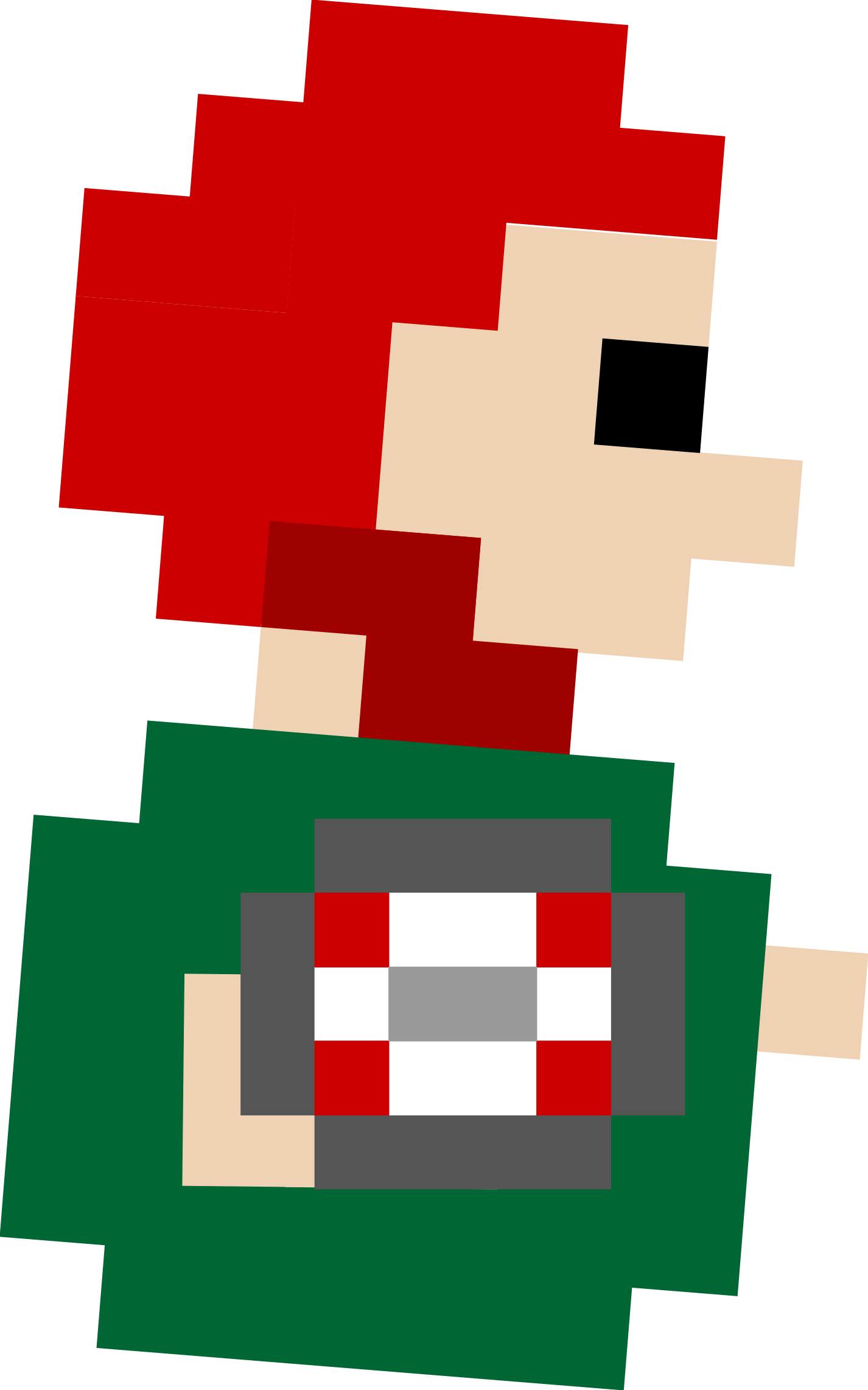
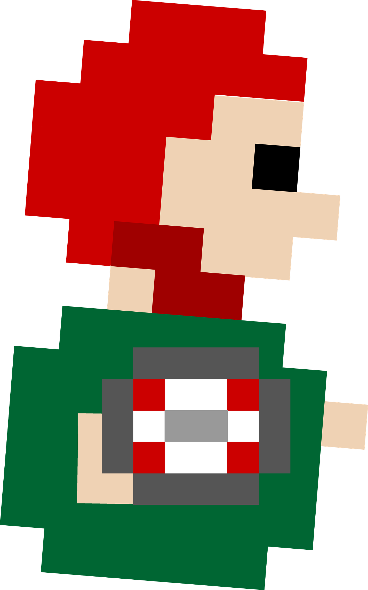
The mascot without extrusion. Same placement as the 3D cuts — the ball sits level and the near arm is squared to it — so flat and extruded artwork agree.
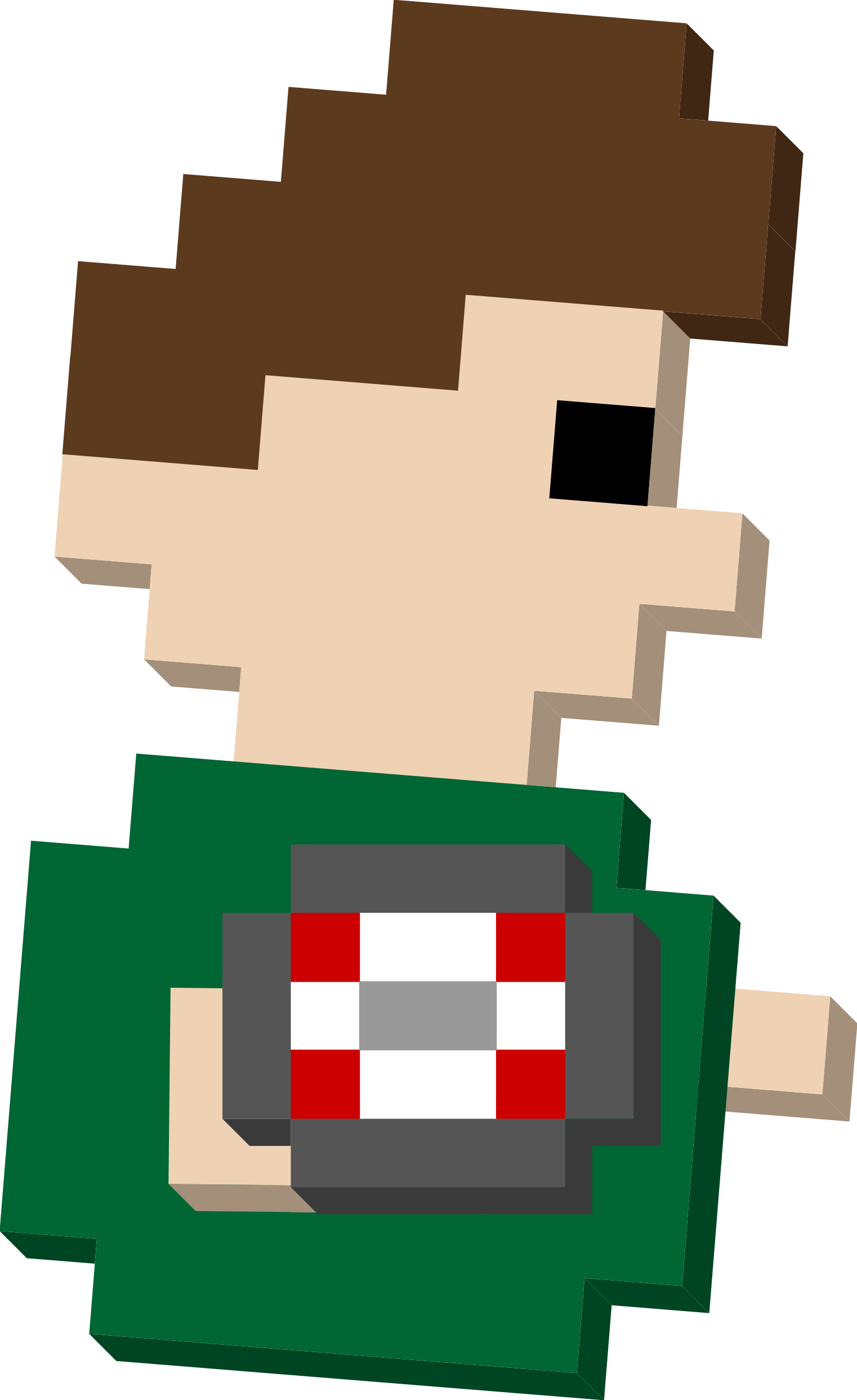
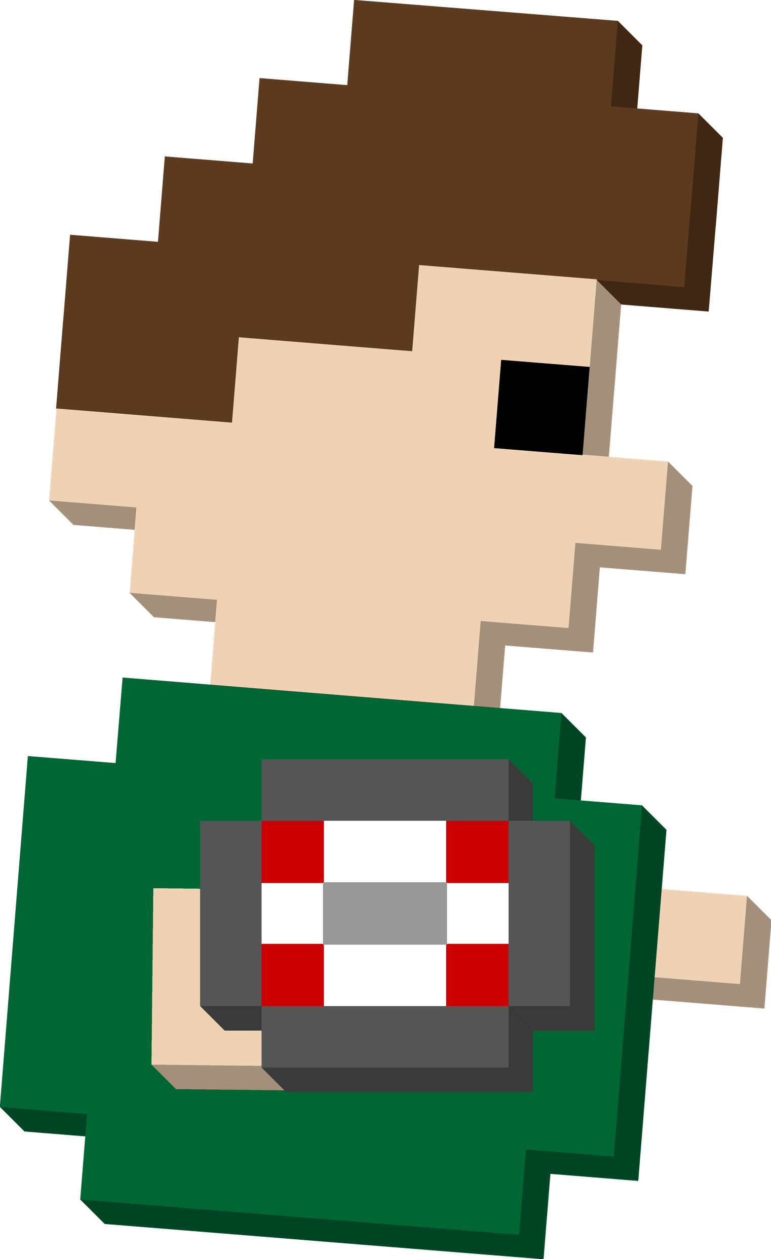
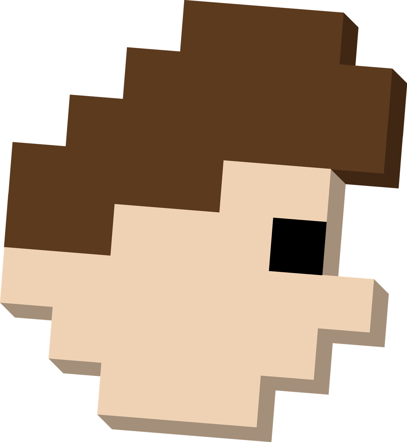
Extruded builds of the mascot with per-block side faces. Every cut ships as SVG (scales cleanly) and PNG (transparent background).
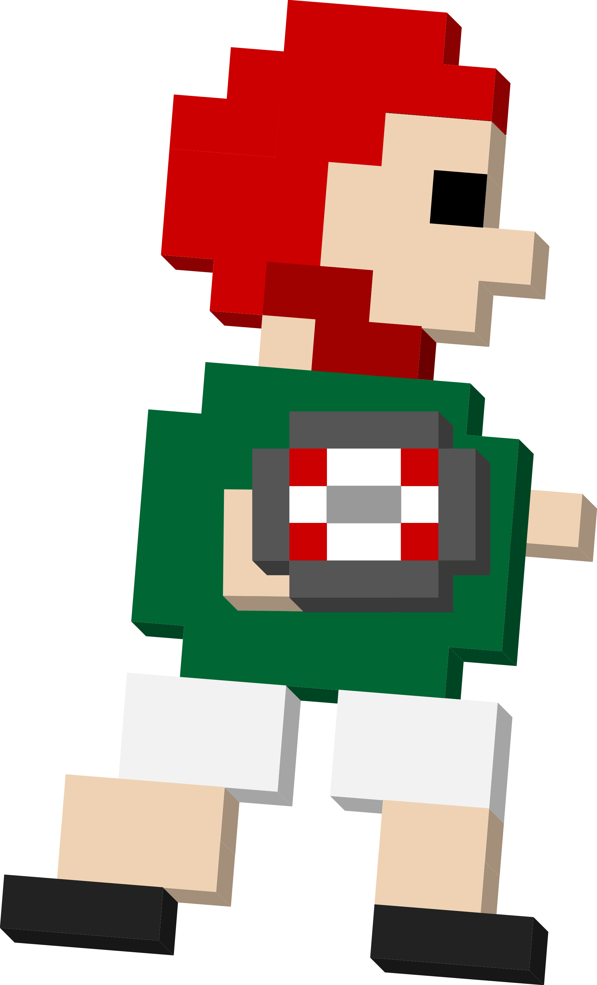
Every cut in a scrum cap, laid out cell for cell from the in-game scrumcap style and coloured with Mexico's capColor (#cc0000). The chin strap is that red at 78%, matching the sprite. Each card links the extruded and flat builds in both formats.
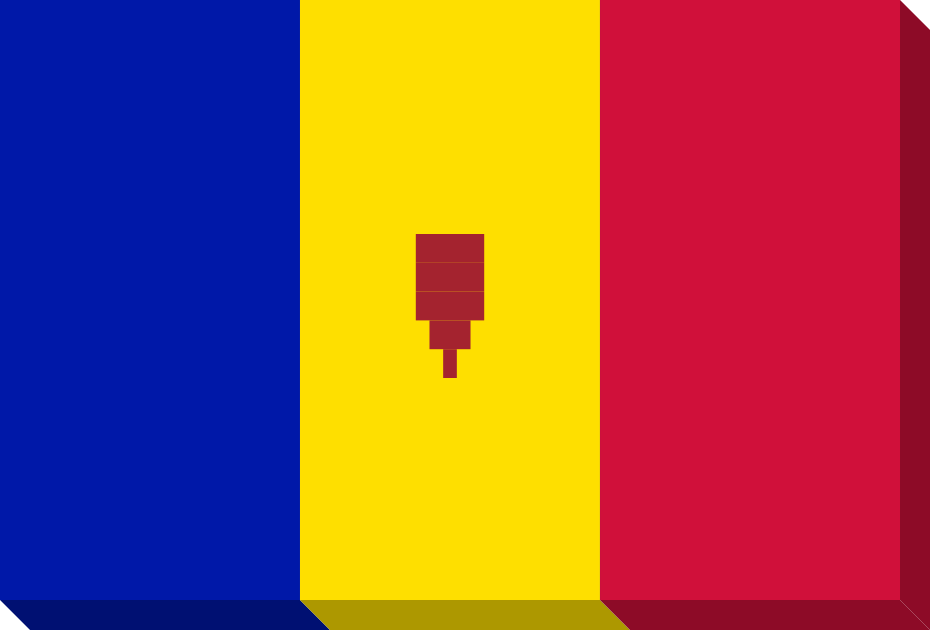
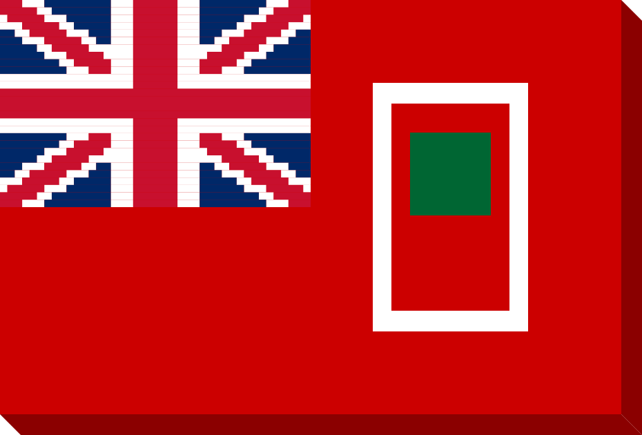
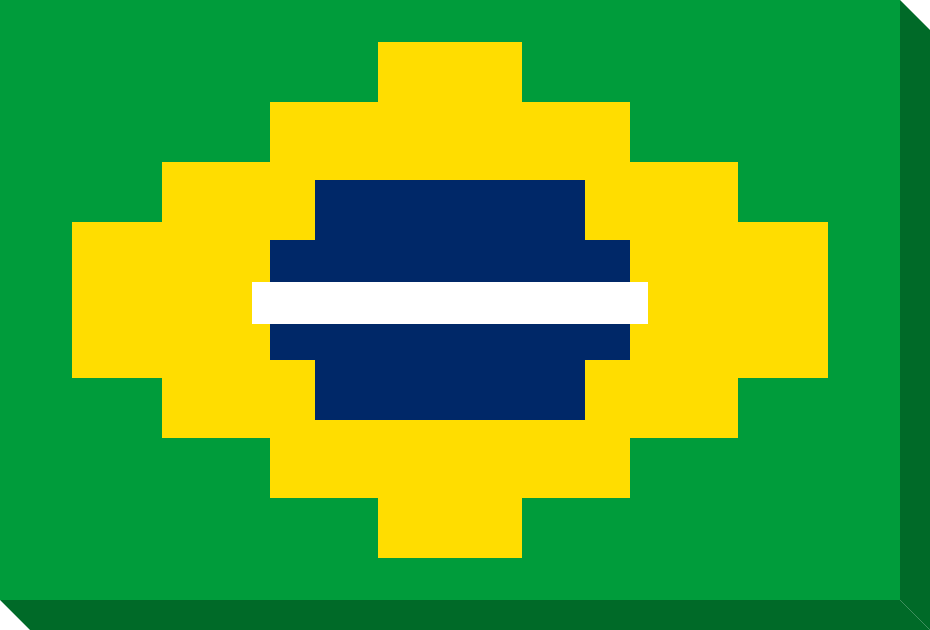
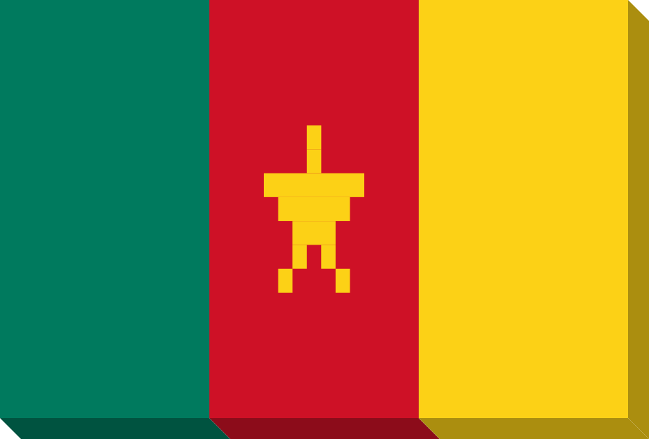
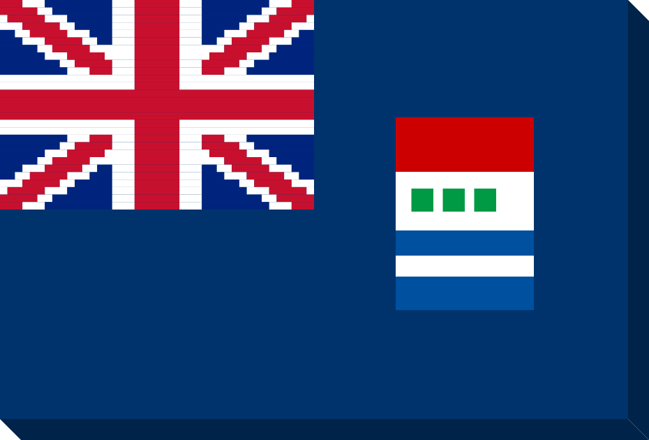
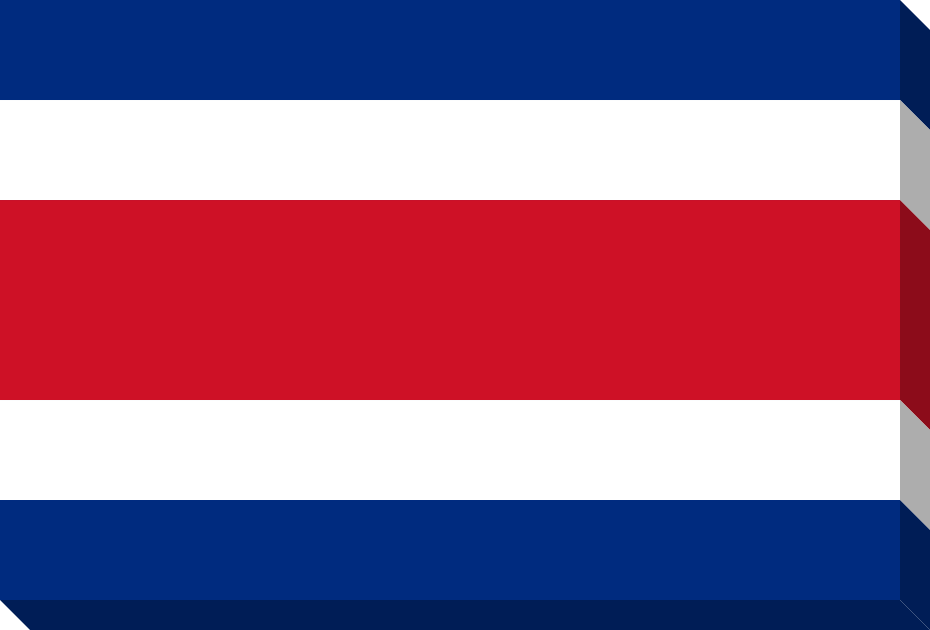
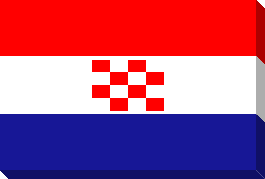
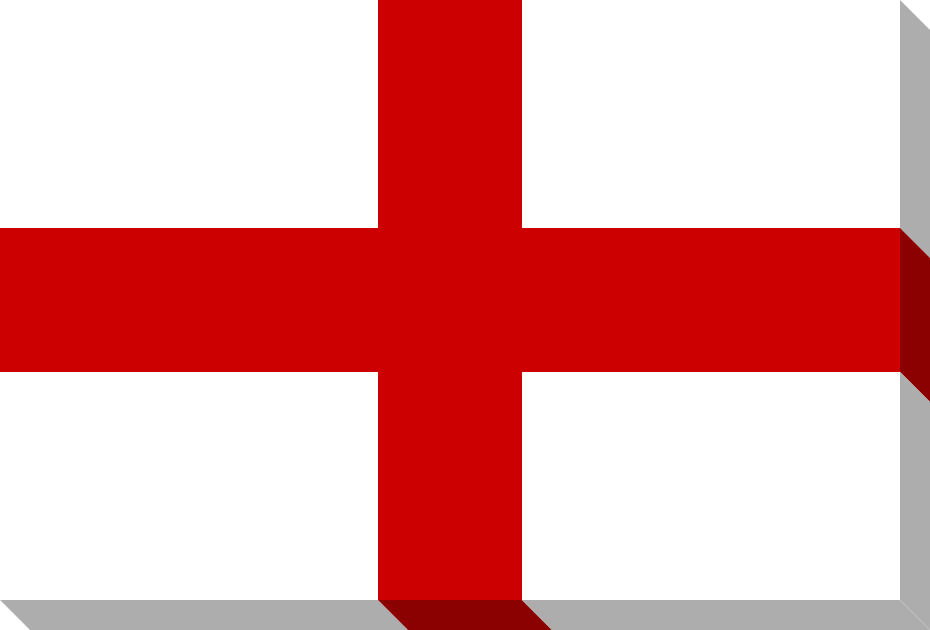
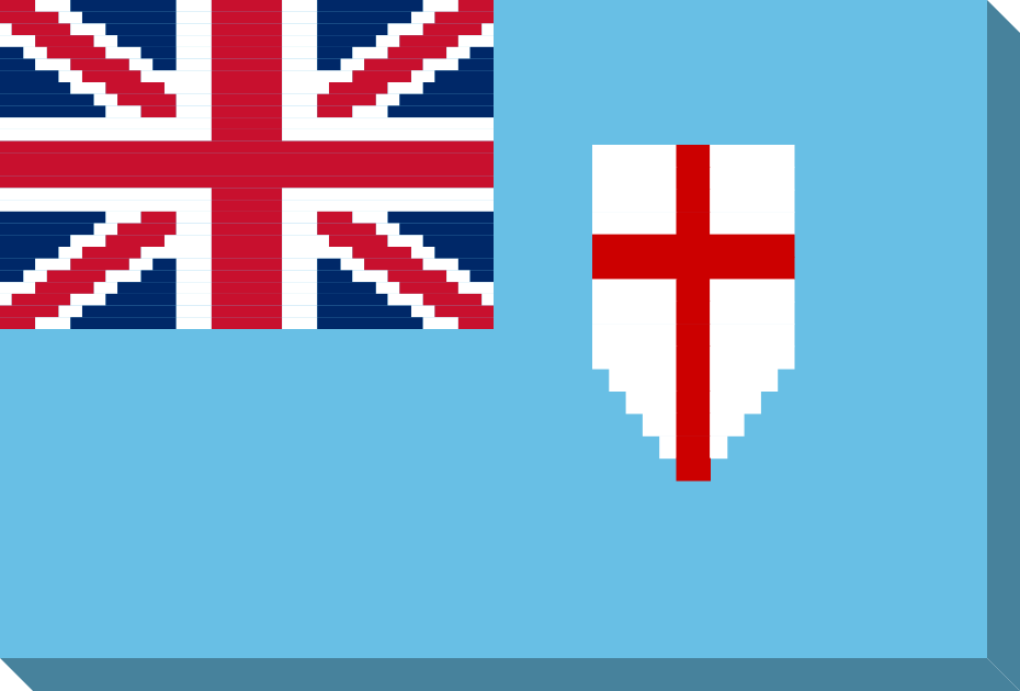
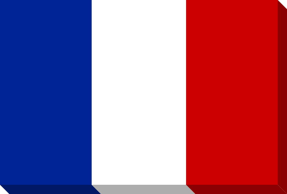
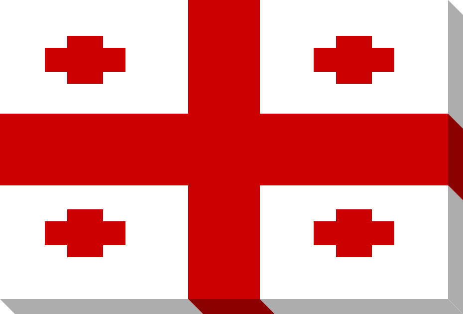
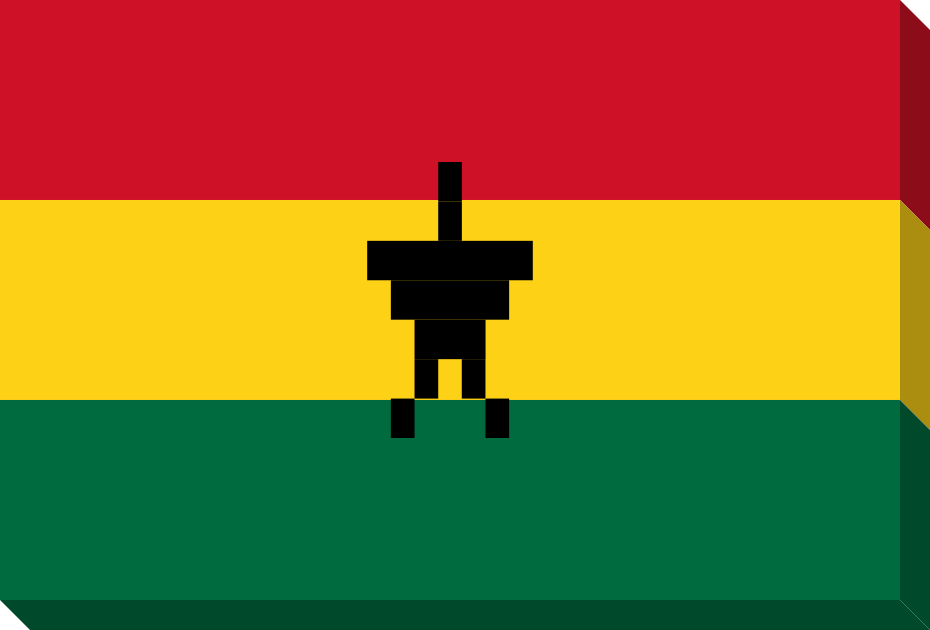
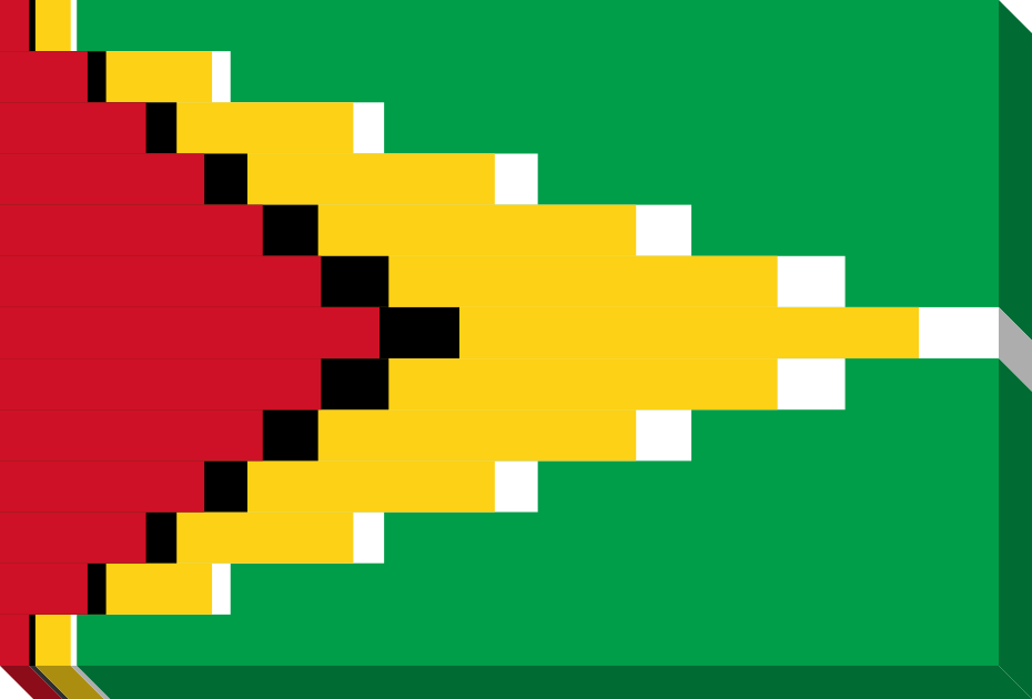
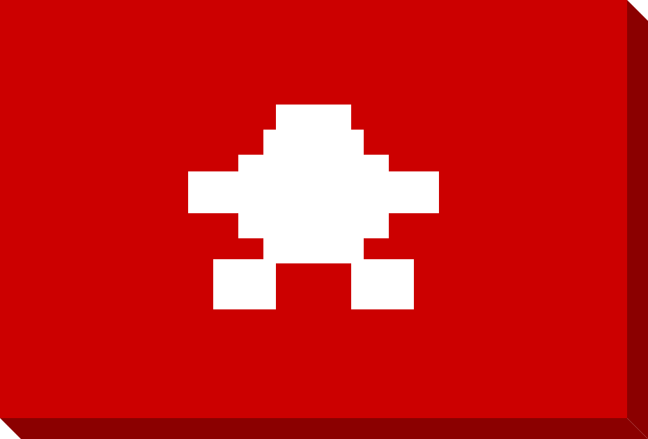
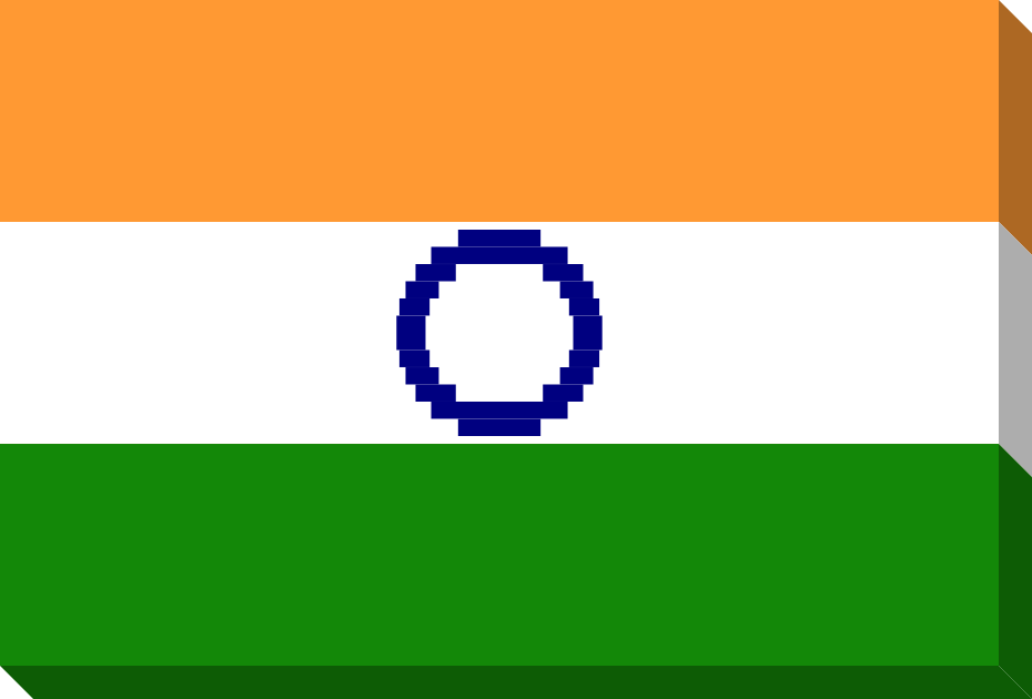
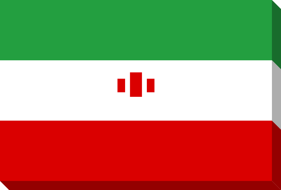
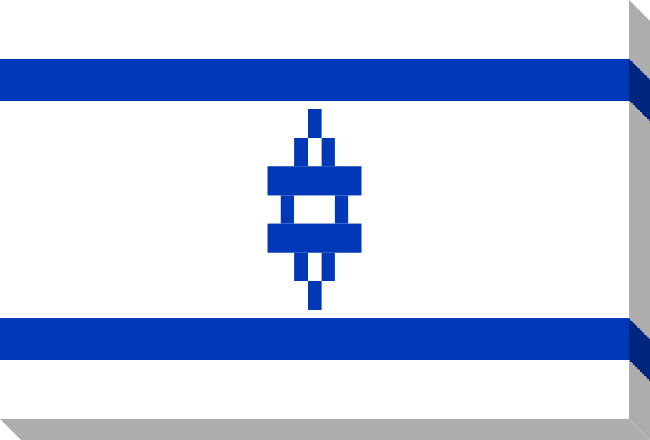
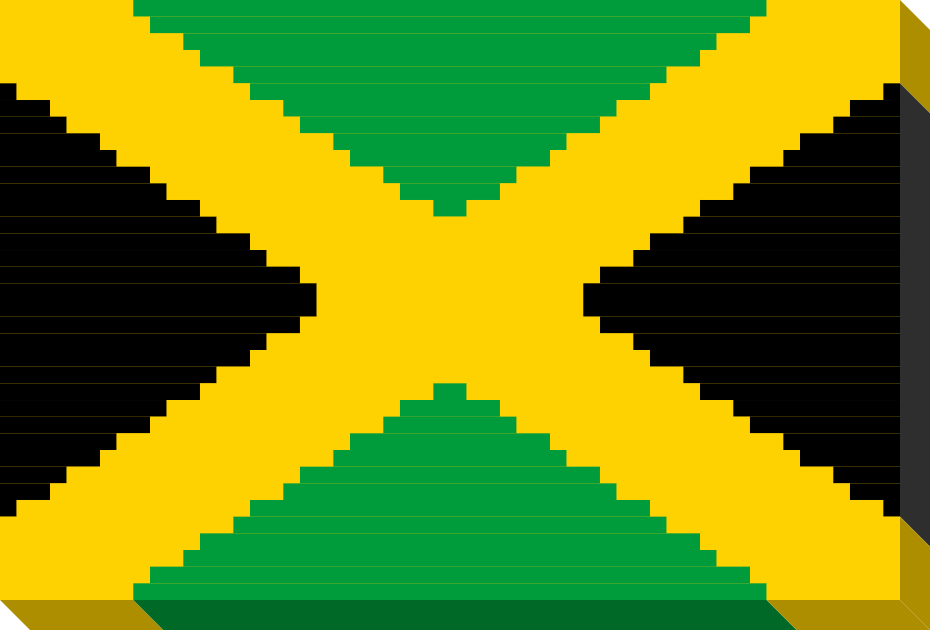
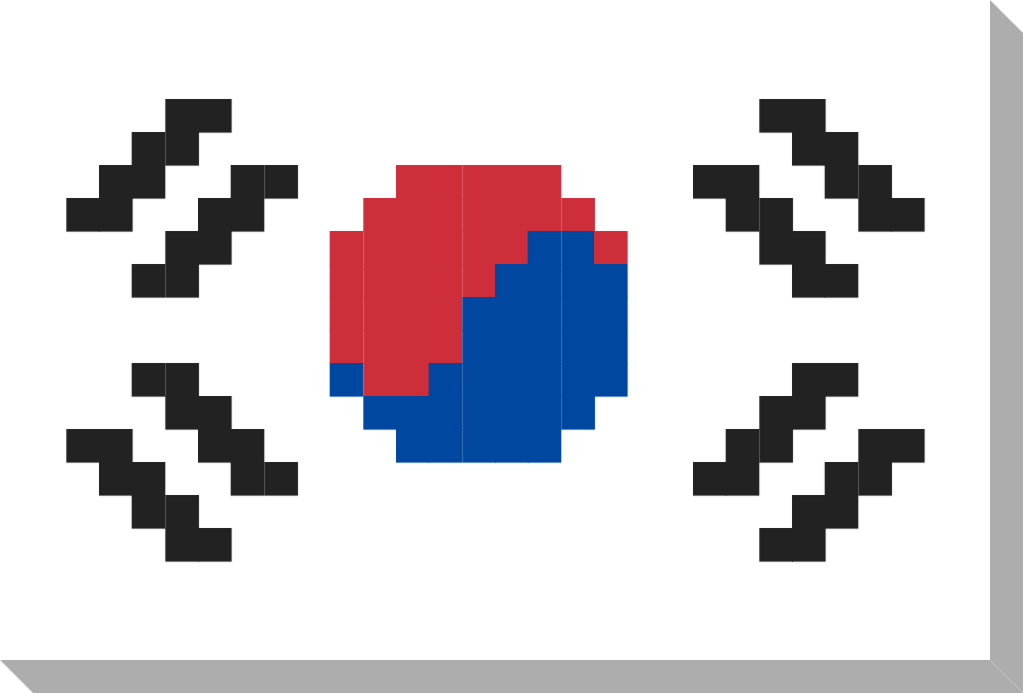
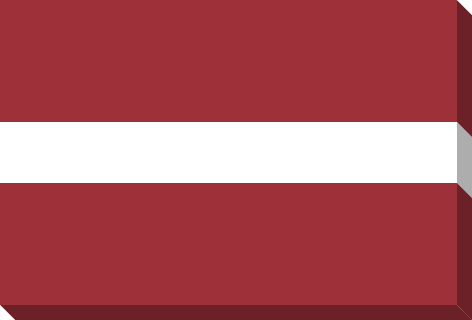
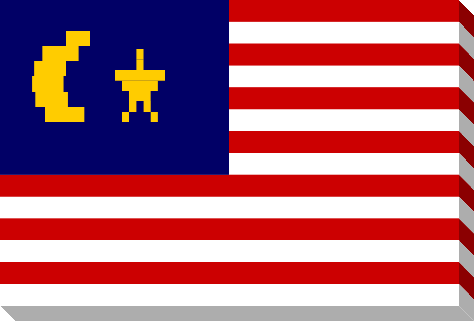
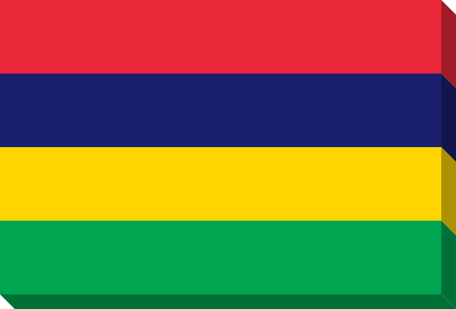
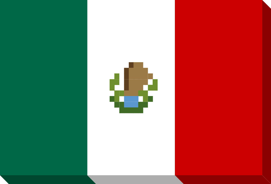
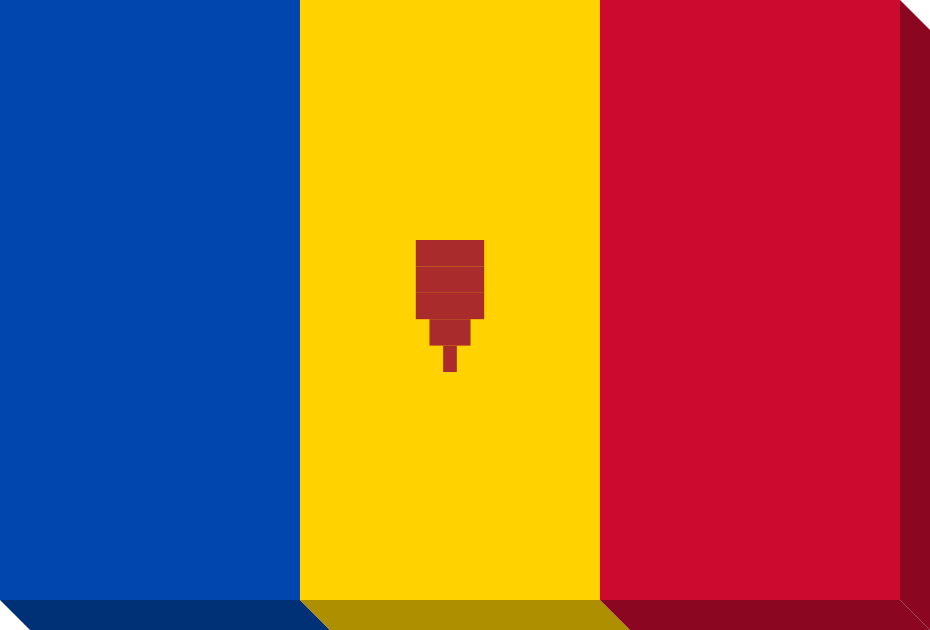
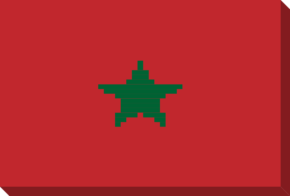
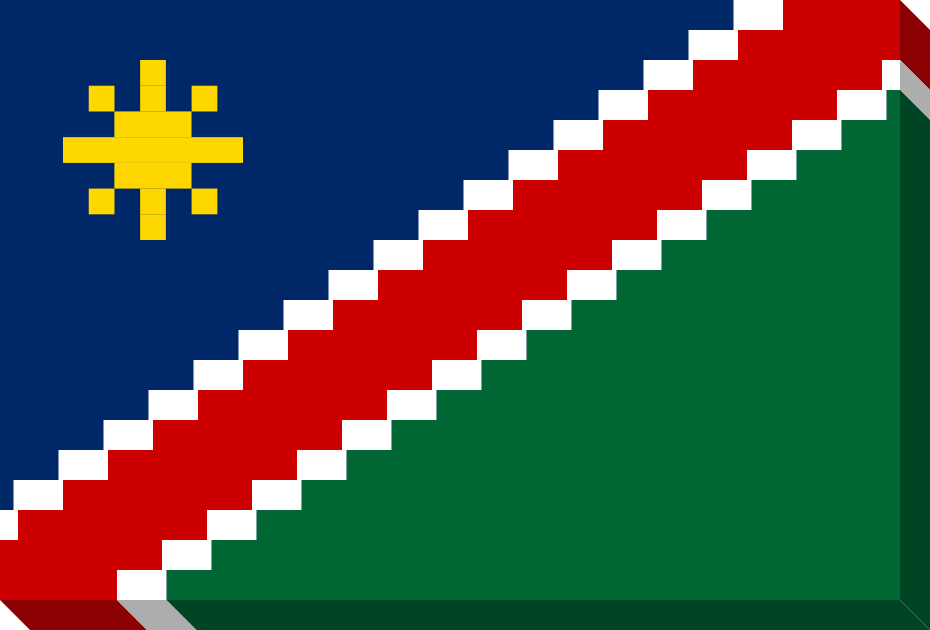
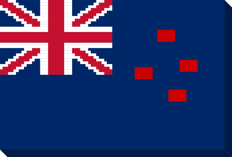
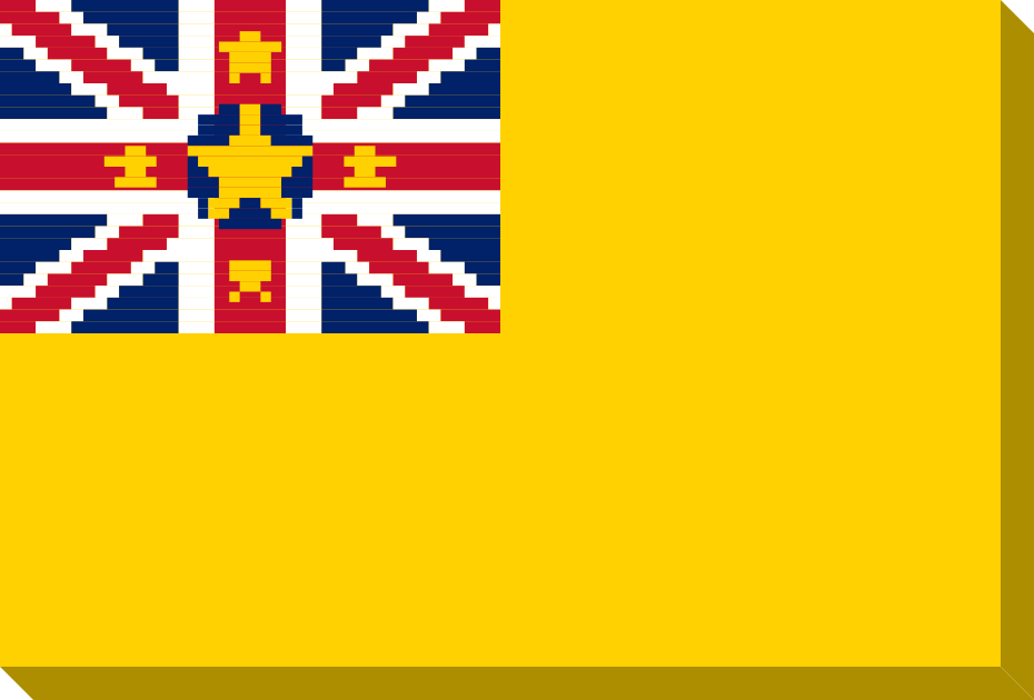
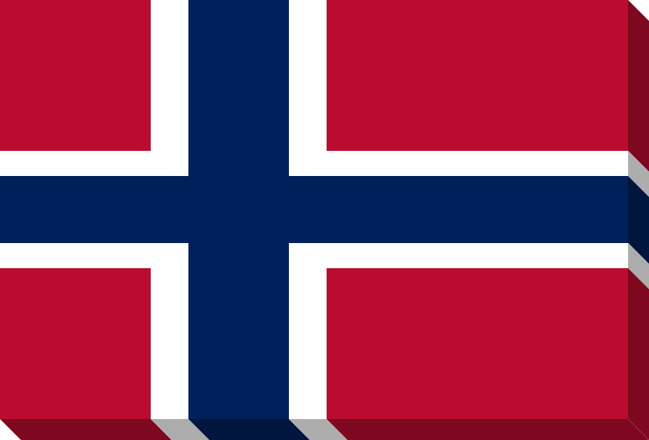
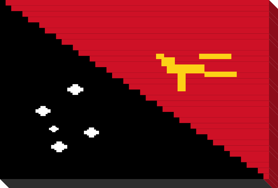
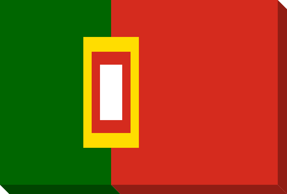
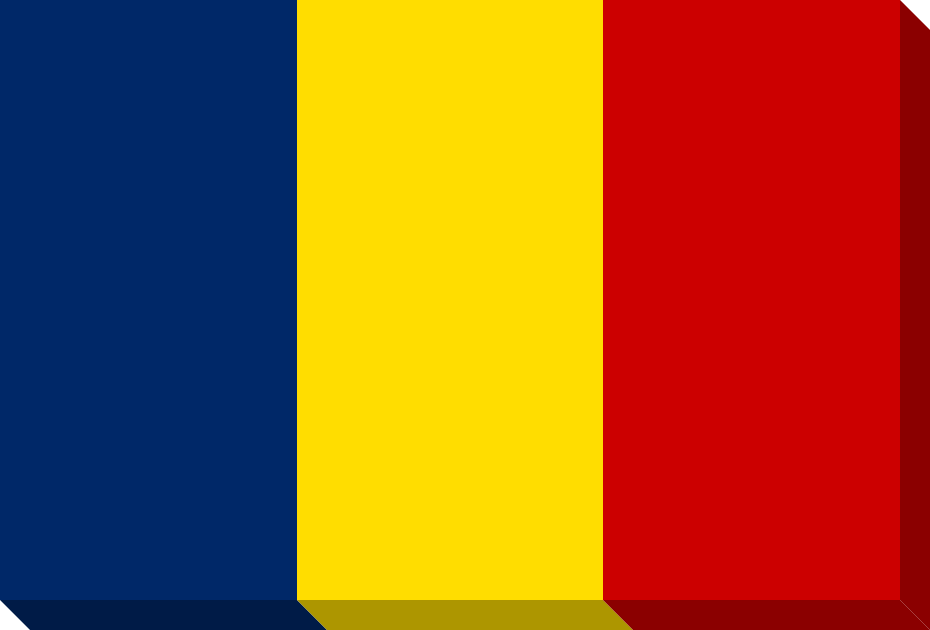
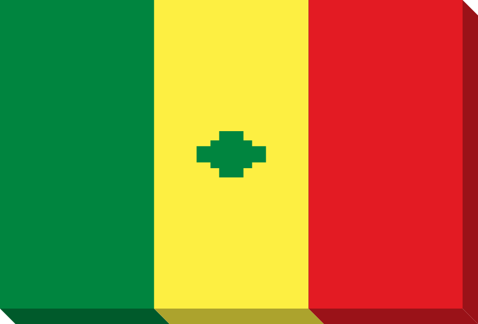
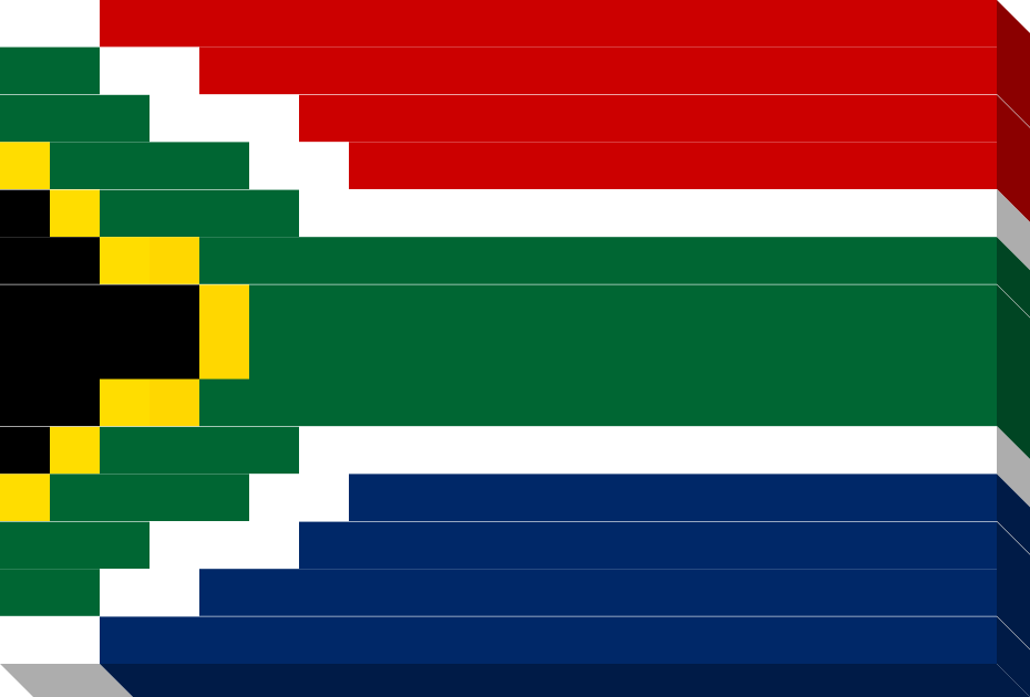
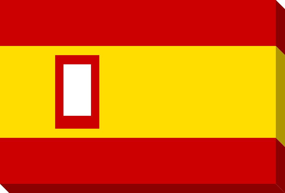
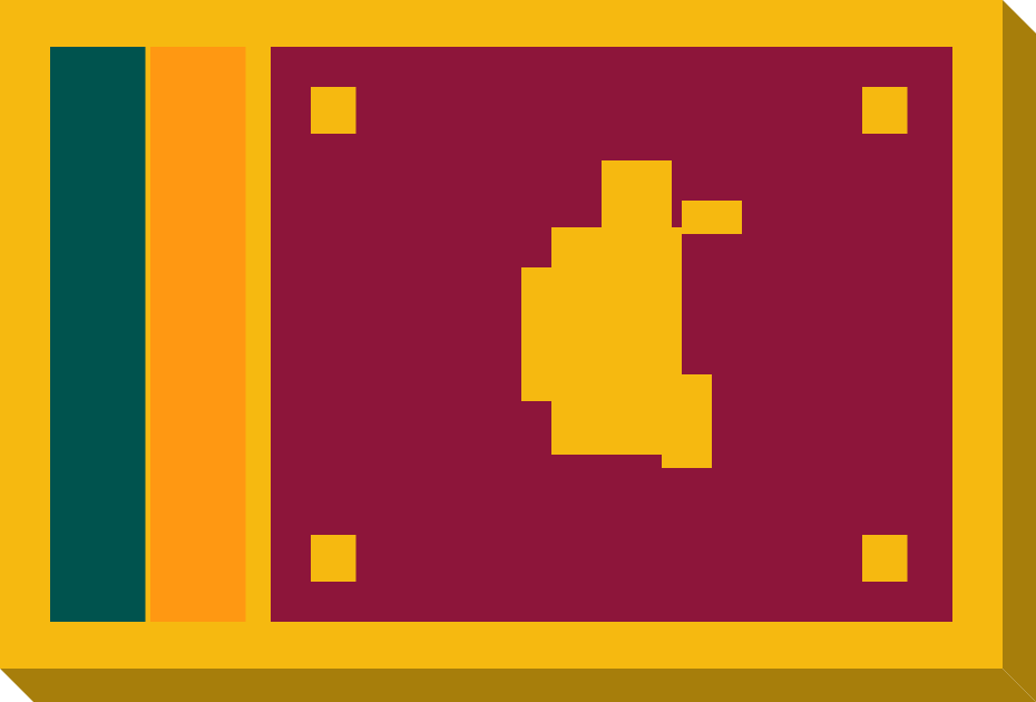
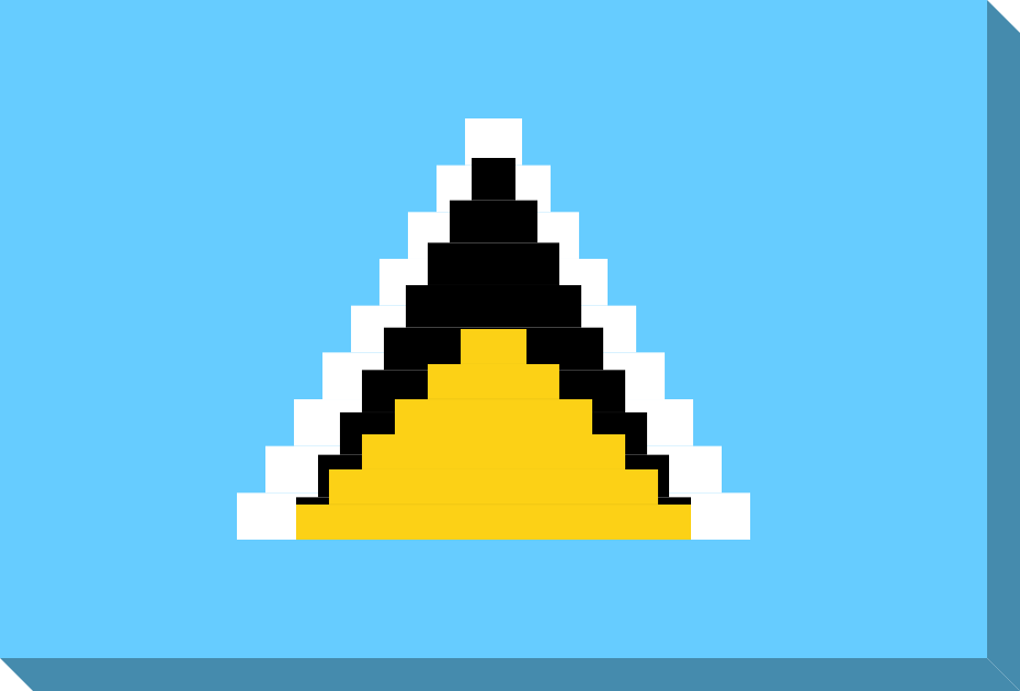
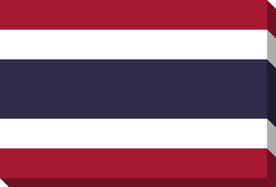
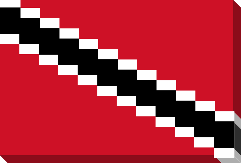
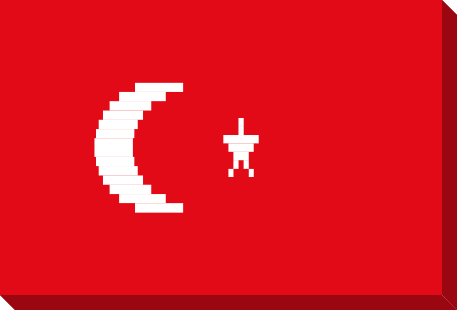
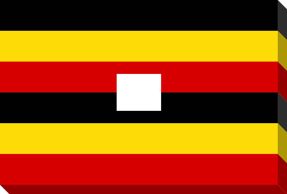
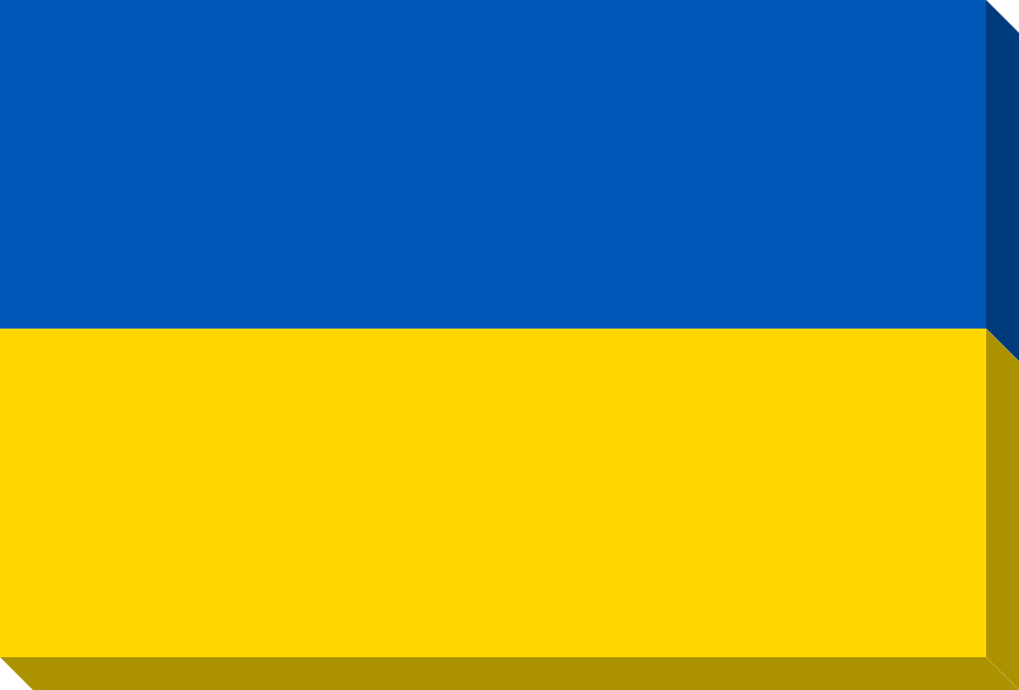
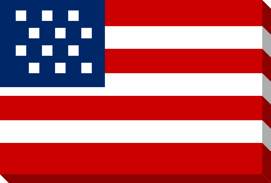
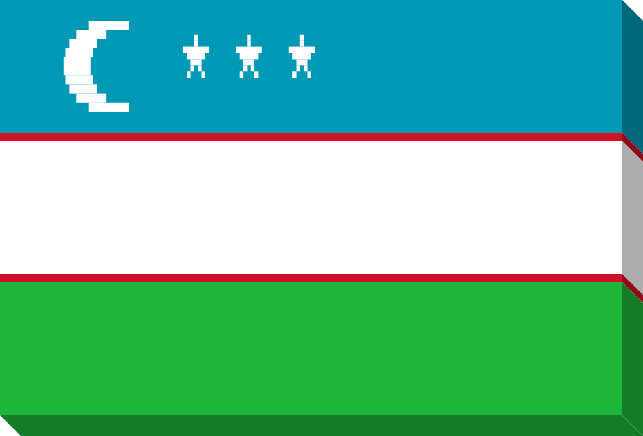
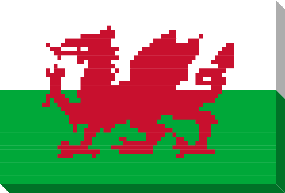
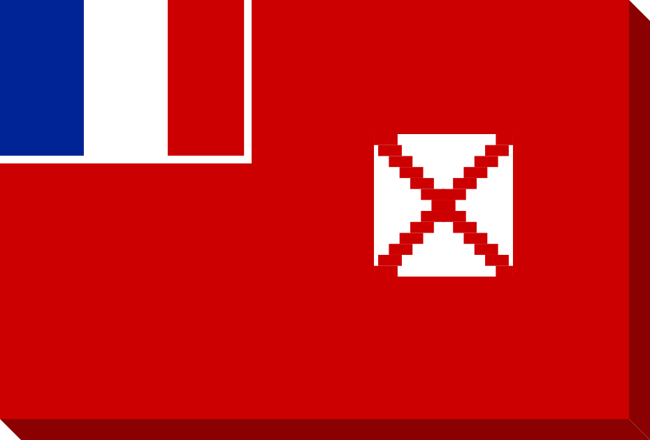
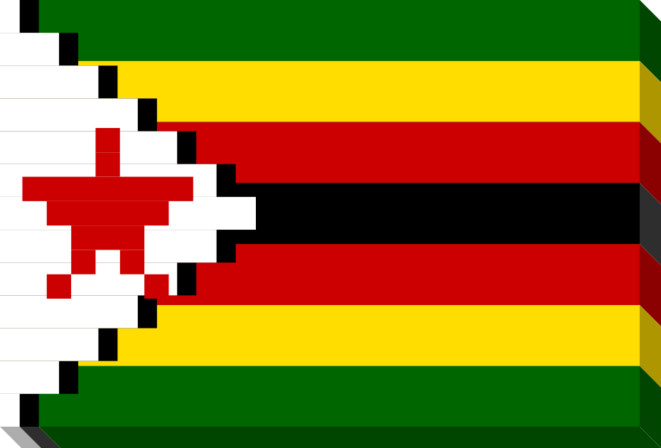
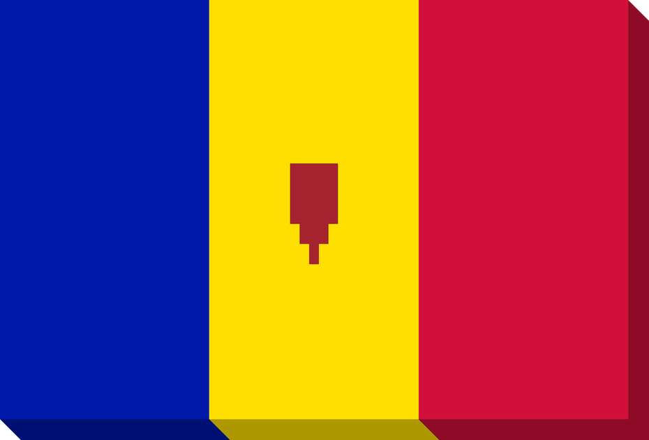
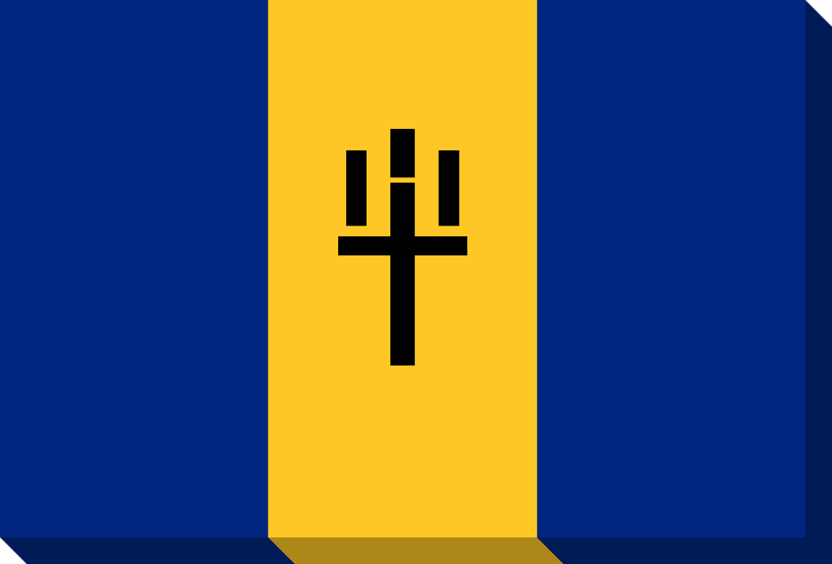
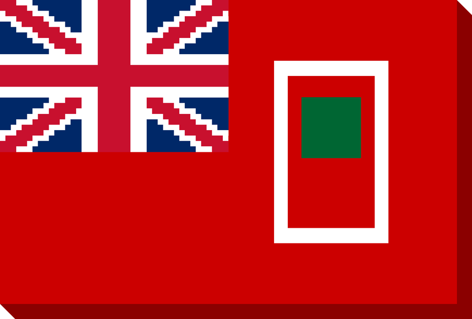
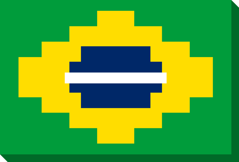
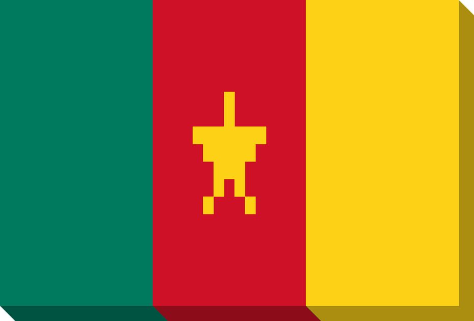
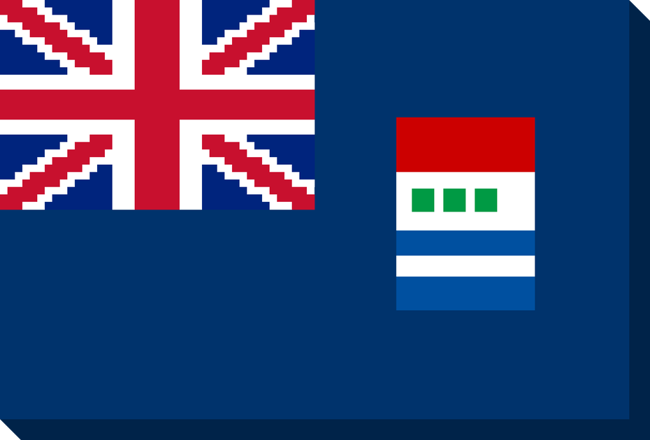
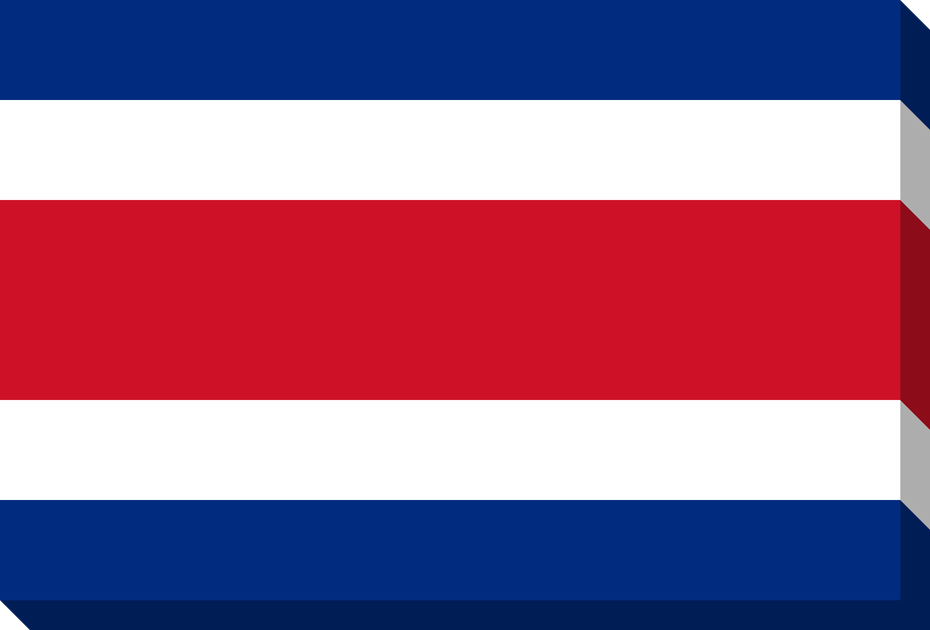
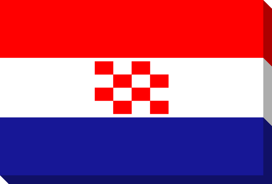
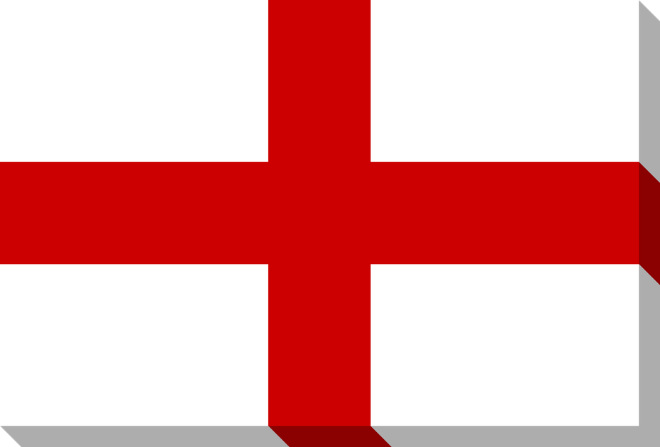
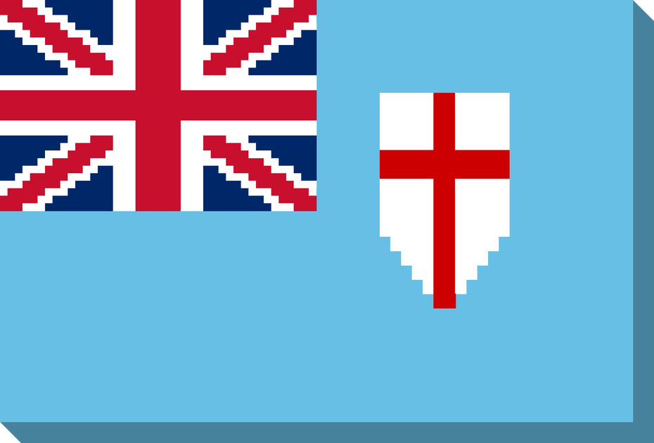
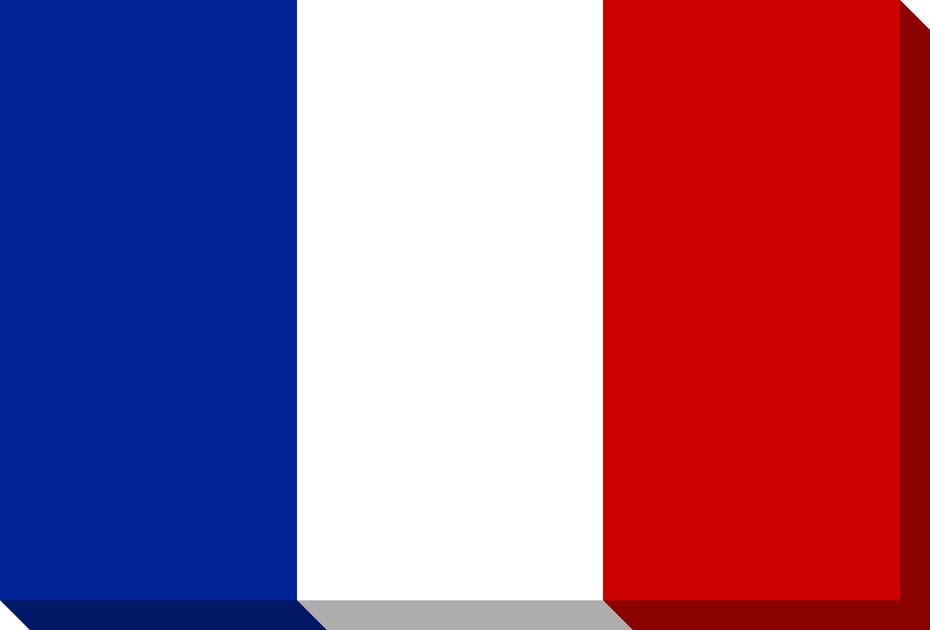
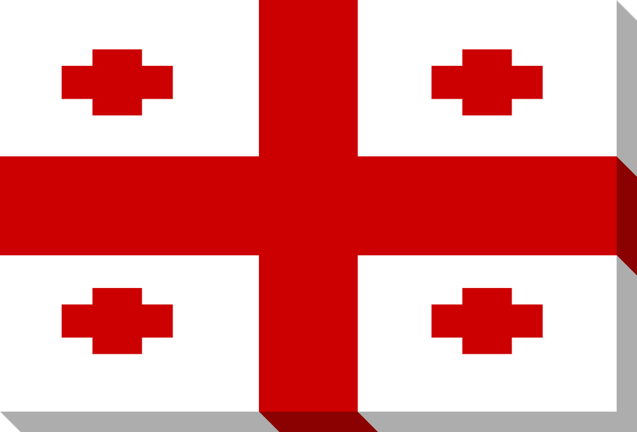
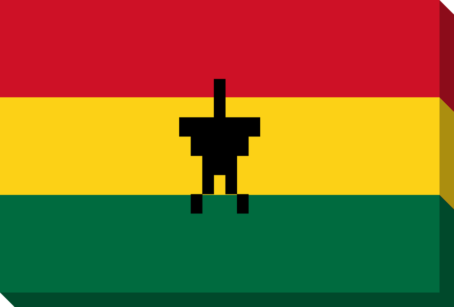
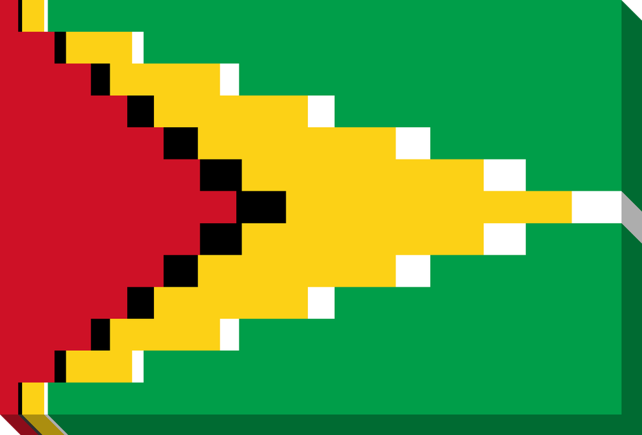
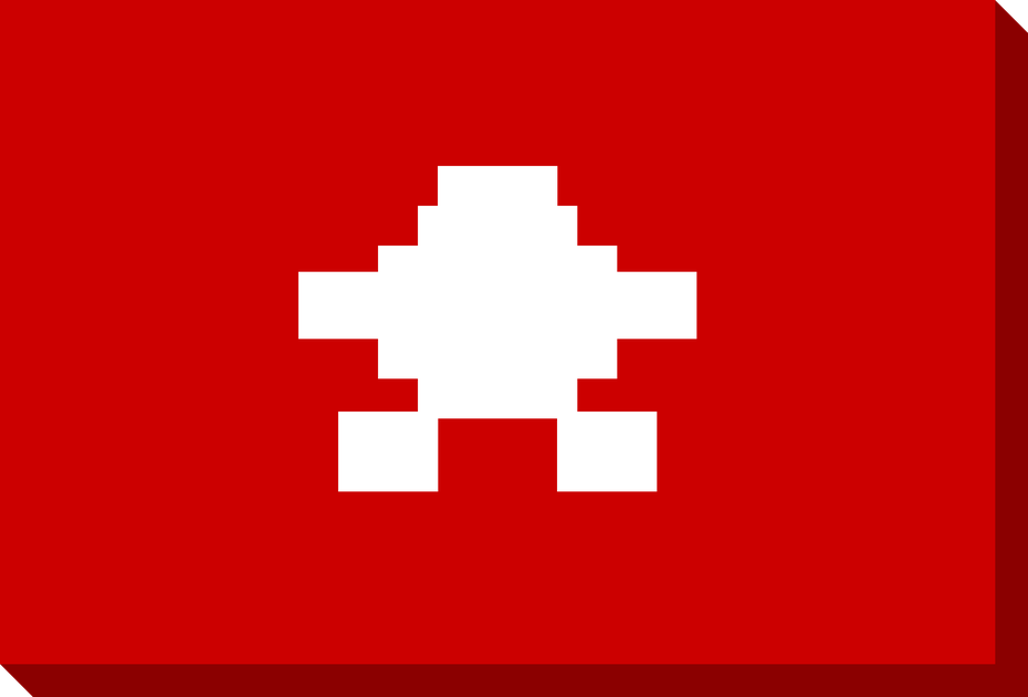
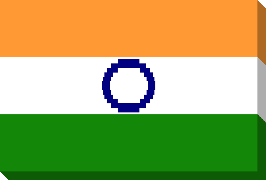
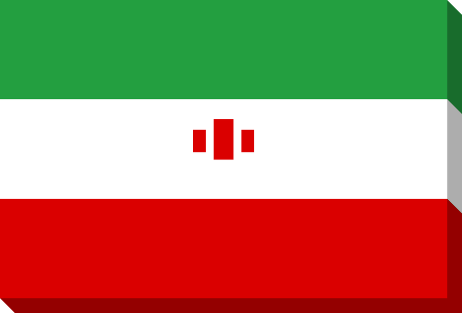
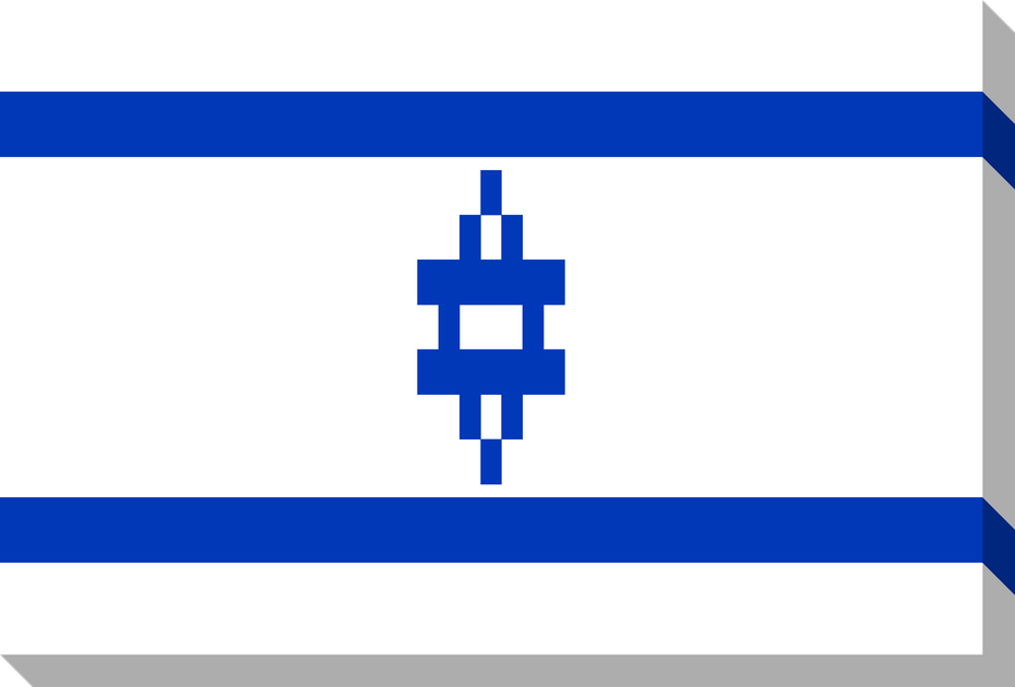
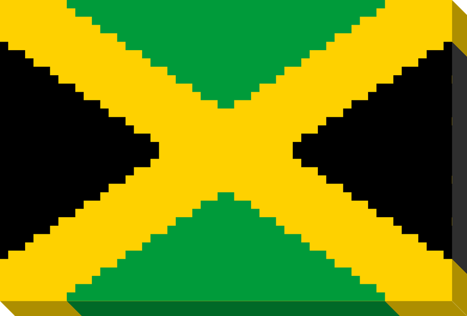
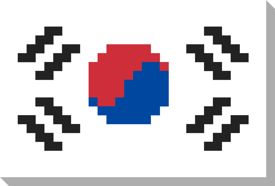
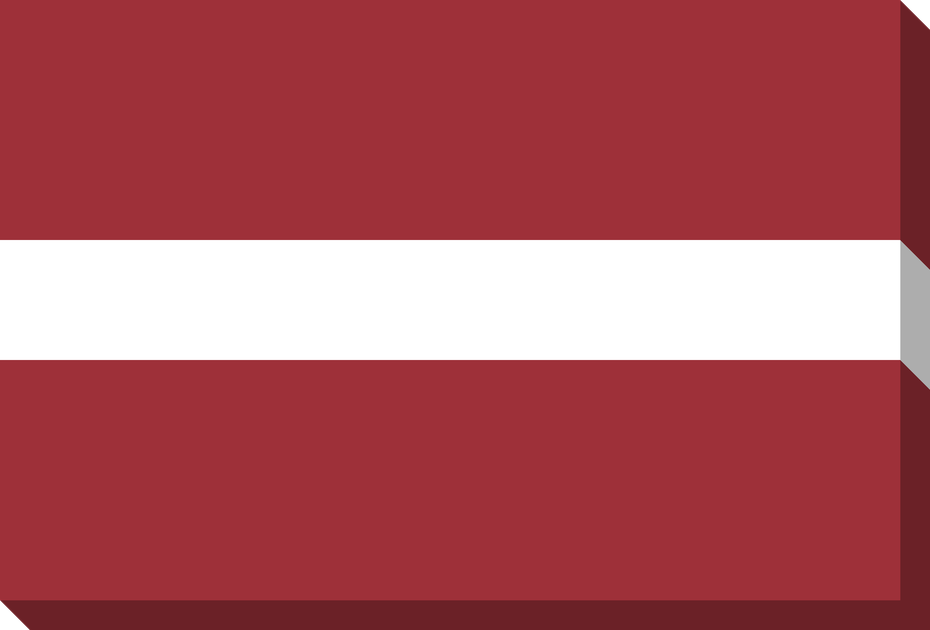
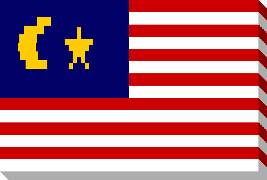
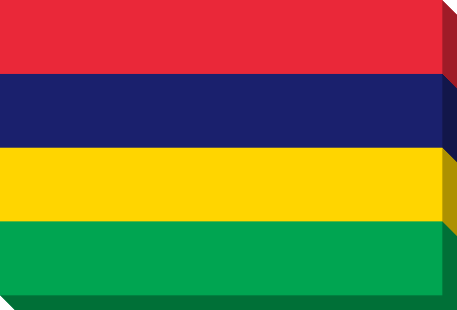
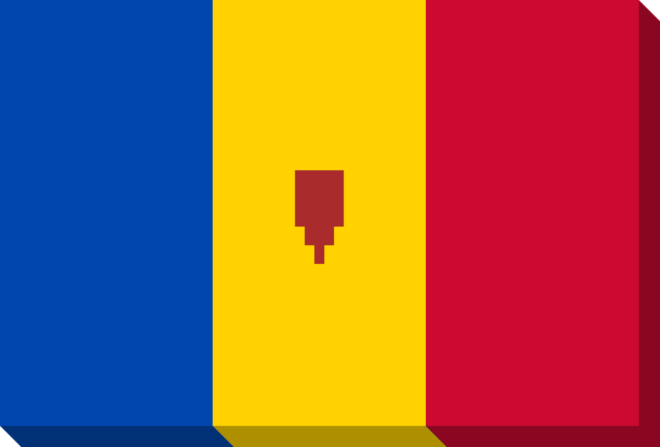
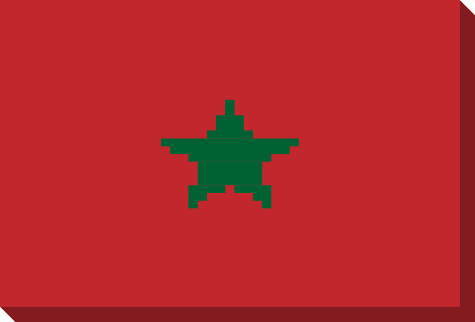
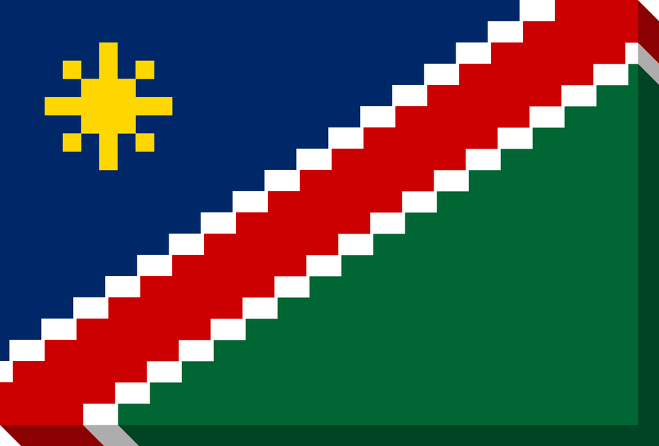
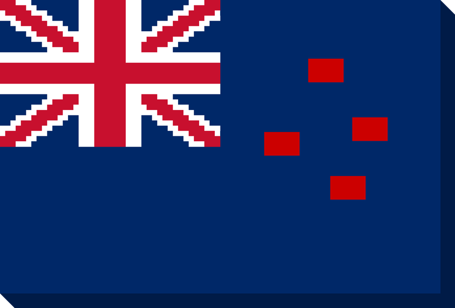
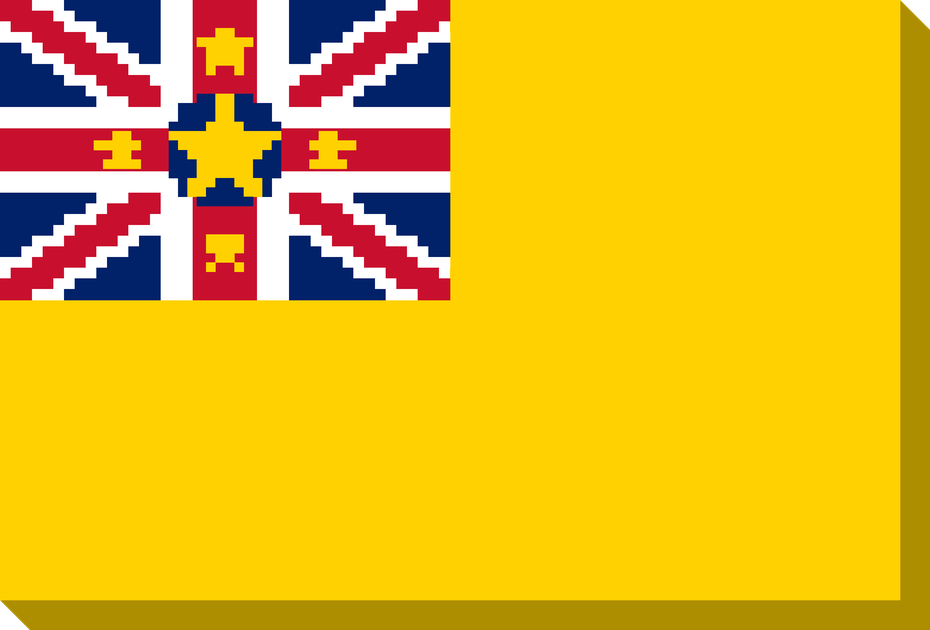
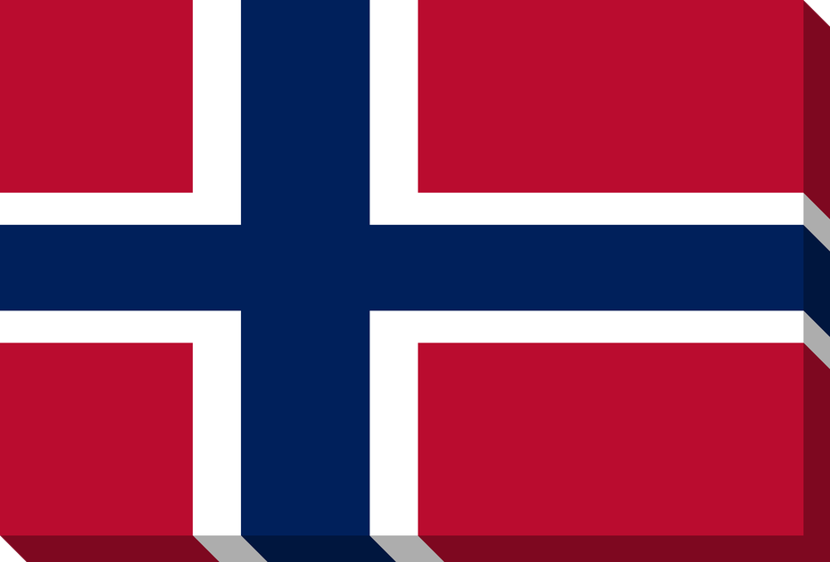
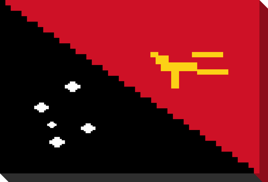
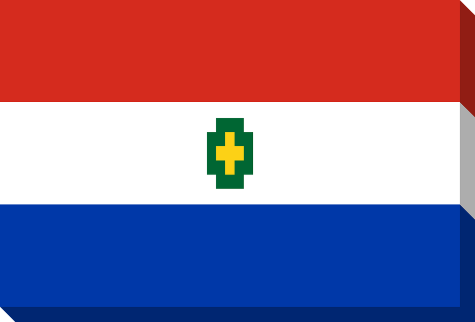
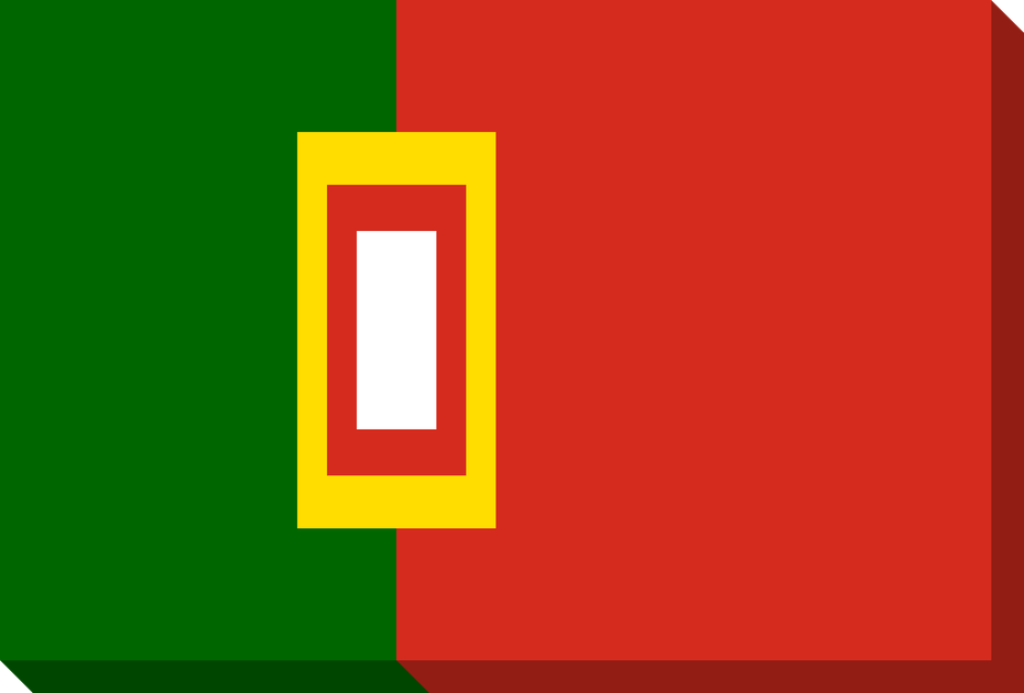
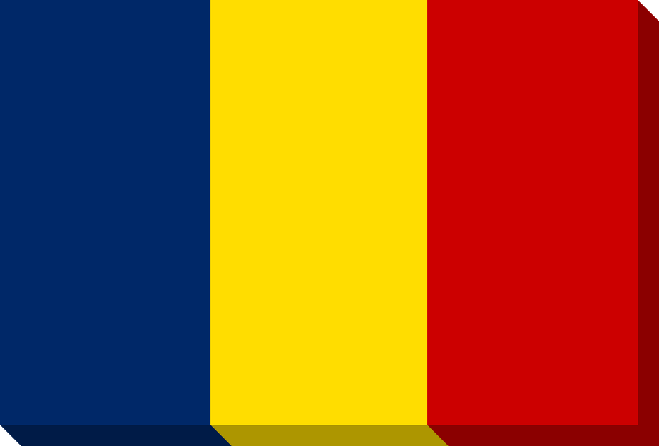
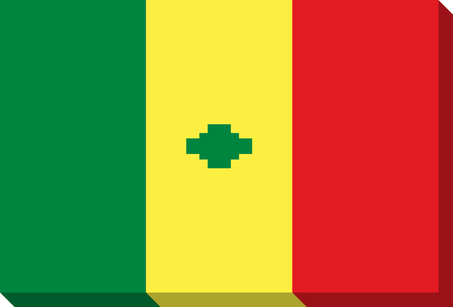
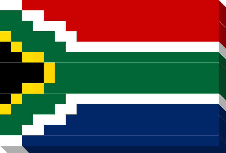
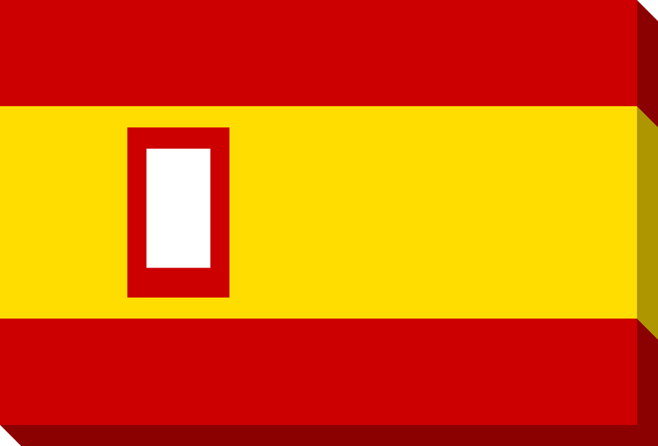
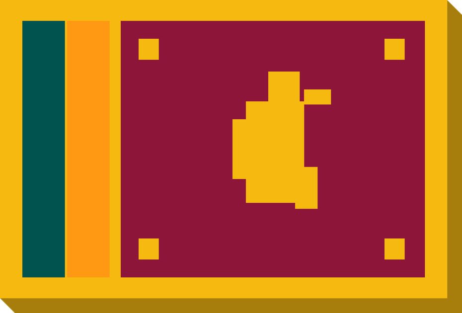
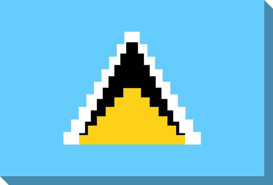
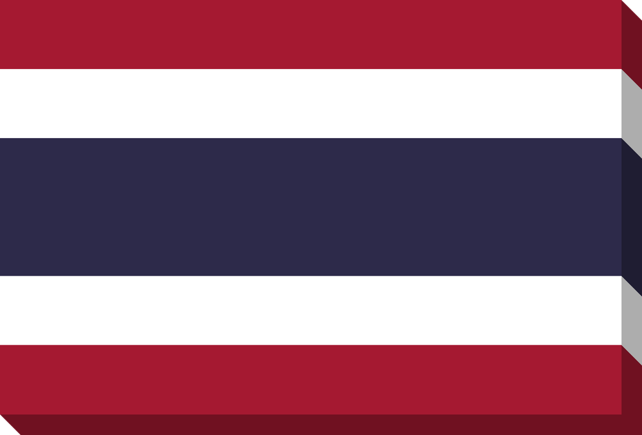
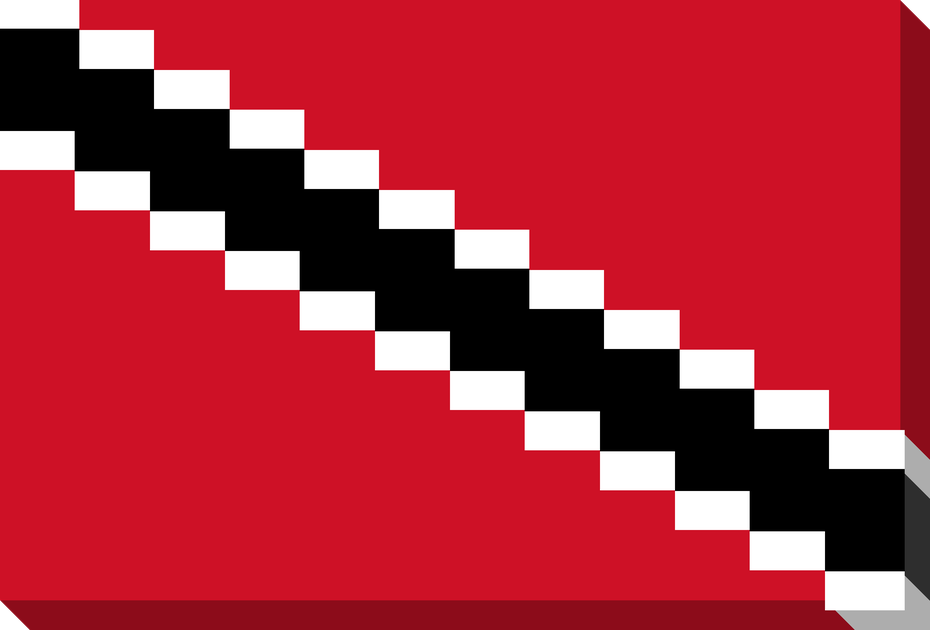
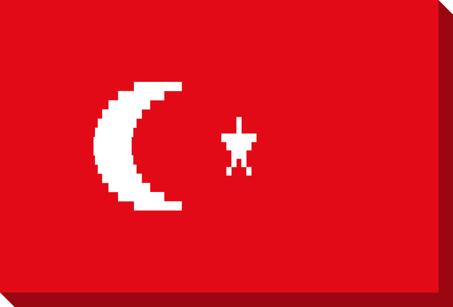
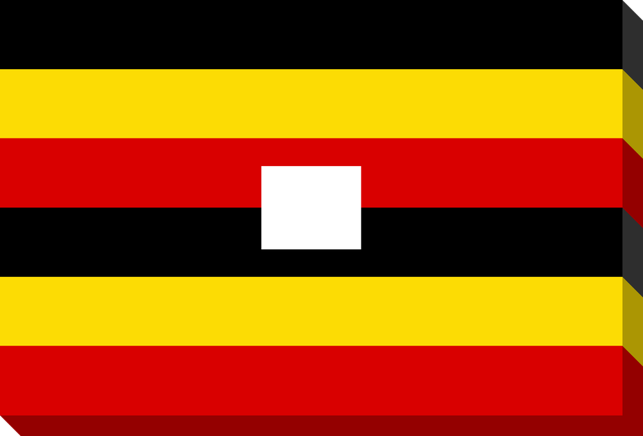
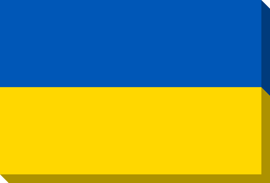
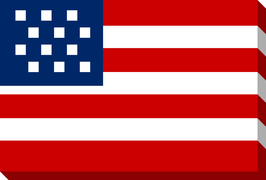
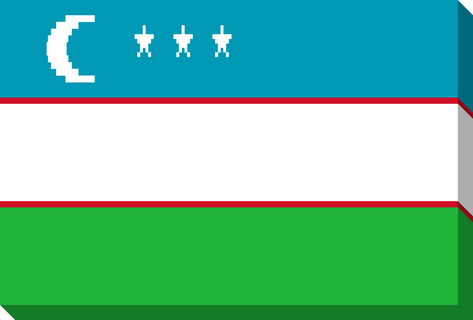
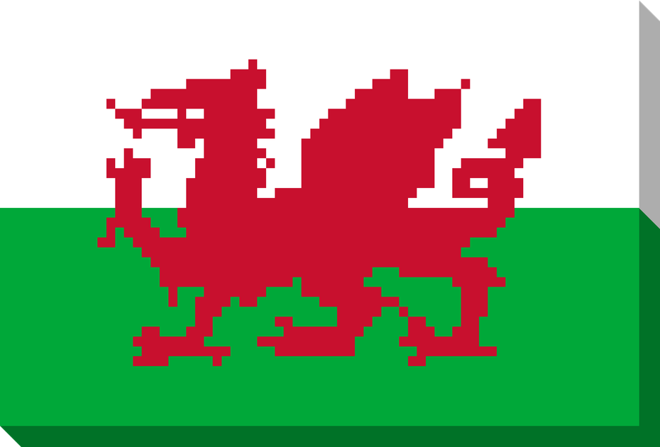
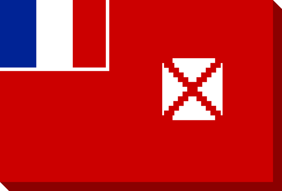
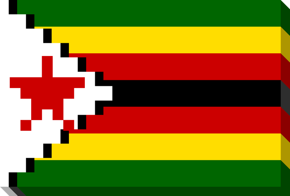
All 100 nation flags, built from the same band data the game uses and given the same extrusion. Only the bottom and right edges lie on the boundary, so each takes the colour of whichever band reaches it — the tricolours and stripes carry through to the side faces. 930 × 630 PNG, plus SVG.
| Attribute | Value |
|---|---|
| Aesthetic | 8-bit and 16-bit era pixel-art sports game |
| Theme colour | #1e6e2e (PWA title bar) |
| Background colour | #2d8c3c (PWA splash) |
| Text style | All uppercase in-game |
| Pitch pattern | Alternating stripes — #2d8c3c / #268534 |
| Crowd & weather | Animated pixel crowd, dynamic weather effects |
Eighteen lengths are available, in the order the in-game style picker cycles them.
| Style | Description |
|---|---|
Normal | The default. A three-row volume on top of the head. |
Short | A flat-top crop. |
Buzzcut | The same shape shaved down to 20%-opacity stubble over the scalp. |
Long | Normal's top silhouette plus a back cascade: a sideburn extension and four taper rows falling past the shoulder, ending in a single-pixel tail. |
Mullet | A solid crop on top, a taper at the temple, and two columns of length straight down the back, narrowing to one at the collar. Long puts its length beside the face; the mullet puts it behind the head. |
Viking | A top knot with faded sides: Short's tight crown, no forehead fringe because the hair is combed into the knot, and Fade's taper at the temple. The knot's fourth cell is the tie, painted in the worn shirt colour (team.colors[0]). |
Ponytail | Viking with the sides left on: the same tight crown, knot, tie and loose ends, without the faded temple: the side is solid hair down to the ear, Short's temple, with a wisp at the hairline and a loose strand in front of the ear. |
Braid | The ponytail's pulled-back crown, wisp and temple, with one short plait down the back of the head, notched every other row so it reads as plaited, tied off at the collar in the scrum cap colour with a tuft below. |
Side braid | The same plait brought forward over the near shoulder: down the side of the face to the neck, then zigzagging across the chest, tied near its end. The only style drawn over the shirt, from its own table (HAIR_LATE) after the jersey and its pattern. |
Low bun | The hair pulled back into a round bun at the nape rather than the viking's knot up top: the ponytail's tight crown, no fringe, a 2×2 bun at the back of the neck and its tie in the worn shirt colour. |
Curly | Widens the silhouette a row and pokes two single-pixel curl bumps up above the crown. |
Messy | Raises the whole mop a row, squares off the sides, and adds side volume at the temple. |
Fade | Paints no solid base. It lays 80% → 80% → 70% → 40% → 20% opacity bands over skin pads on rows -1 through 3, so the hair tapers cleanly into the scalp (burst-fade / taper-fade silhouette). |
Headband | Replaces the forehead fringe rather than sitting under it, which is what a real band does to a hairline. It paints in the scrum cap colour rather than the shirt — see the note below the table. |
Cornrows | Braided rows lying tight to the skull. Short's crown, laid as scalp first, then every row plaited: braid and 40% seam alternating along its length, from the hairline to the back of the head. The style picker shows it as ROWS. |
Cornrows + band | Cornrows under a headband. Short's tight crown, laid as scalp first, then every row plaited: braid and 40% seam alternating along its length, carrying on down the back of the head below the band. The band is Headband's, in the same colour, and the style picker shows it as BRAIDS. |
Scrum Cap | A helmet-shaped silhouette: crown, forehead band, an ear flap on the visible side, and a thin three-pixel chin strap pinching across the jaw onto the neck. The strap paints in a darker version of the cap colour via _darkenHex so it reads as a strap rather than part of the cap. |
Bald | Swaps the hair pixels for scalp. |
Cap and band colour. Scrum Cap and Headband share one resolution chain, because capColor is picked per nation to contrast with the jersey. Per-player capColor wins, then team-level capColor, then the home primary. The game inserts one more step ahead of those two which this page does not have: a side in its change kit resolves to awayCapColor, or failing that to the home shirt colour, so a cap tuned against the home jersey cannot disappear into the away one. This page has no notion of a pre-swap home and draws only a home kit; /nations and /clubs resolve the away branch by hand, passing awayCapColor || colors[0] to their away sprite. Most teams in teams.json set team.capColor explicitly to a kit accent (France red, Ireland orange, Scotland purple, Wales green, Italy light blue, Australia bottle green, New Zealand dark grey). The Headband card below uses a demo team with a blue cap and a red shirt so the two read as separate.
Setting a style. Per player via team.players[i].hairStyle, or globally on My Team characters. Unnamed darker-skinned slots (tan / brown / dark) auto-default to Short on even slot indices, or Buzzcut with Very Dark #111 hair on odd ones, instead of Normal — except the fly-half slot (index 2), which auto-defaults to Fade so the playmaker reads as distinct in the squad row.
All game characters and objects are hand-drawn pixel art rendered on a canvas. Sprites use integer coordinates scaled by a factor to keep crisp edges at any size.
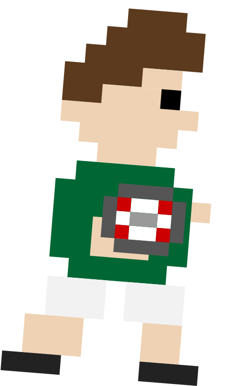
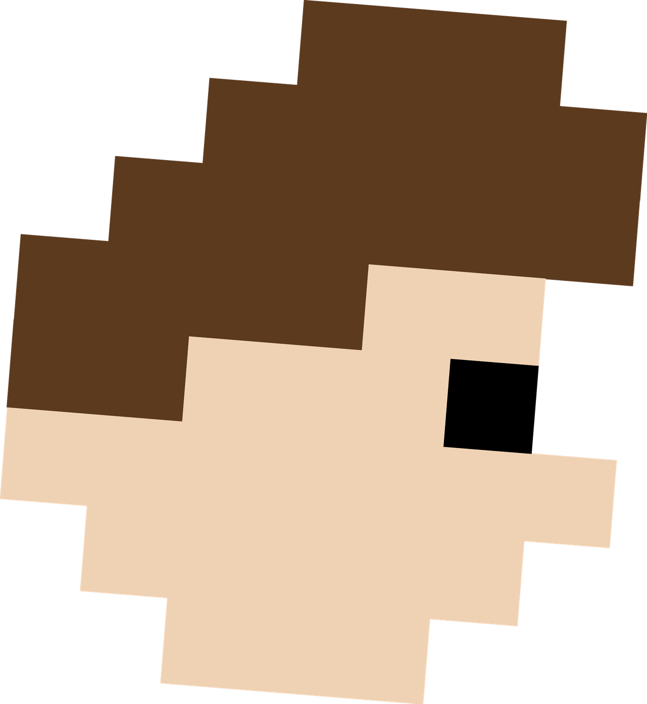
The base player is 10 pixels wide by 18 pixels tall, scaled by a factor of 1.8 in-game. Each player is composed of hair, head, jersey, shorts, an ankle-high sock band (defaults to the player's skin so legs read bare; override with socksColor for a colored sock), and boots.
| Part | Size (px) | Colour Source |
|---|---|---|
| Hair | 6 × 3 | Team hair config (dark, brown, blonde, red) |
| Head / Face | 5 × 3 | Skin tone palette |
| Eye | 1 × 1 | #000 |
| Jersey | 8 × 6 | team.colors[0] primary, team.colors[1] accent |
| Shorts | 6 × 2 | team.shortsColor or team.colors[1] |
| Legs | 6 × 2 | Skin tone palette |
| Boots | 6 × 1 | #222 |
The player seen from the front, head and shoulders: the squad cards on a team card, the FRONT view in Edit Player, and the trading cards and studio scenes on the marketing pages. It is drawn on a 24-wide grid with a white sticker border traced around the silhouette, the jersey carries a front view of the kit pattern, and every one of the eighteen hairstyles has its own front drawing. One shared file draws it everywhere, so a change to a hairstyle lands on every page at once.
Hairstyles. The eighteen Edit Player offers, in its order, on the Medium skin tone with Dark Brown hair.
Skin tones. The five tones of the character palette, Light to Dark, each with the hair it most often gets.
Facial hair and glasses. Stubble, a full beard and a moustache, which takes the beard's colour, then glasses and sunglasses. A face carries one of each at most.
Players cycle through 4 frames at 150 ms per frame (~6.6 fps). Arms and legs alternate stride positions.
Teams can have solid, striped, quartered, harlequin, halves, sash, diagonal, slopes, cross, wavy or checkered jerseys using their primary and secondary colours. Diagonal is half a collar with a band falling off it: the right half of the collar row, then one column outward per row until it runs off the edge of the shirt. It is the only pattern that stops short of the hem, and it stops because it runs out of shirt rather than because it was trimmed. Slopes is that same angle repeated — three parallel bands two cells wide, running the opposite way to the sash so the two never read as versions of each other. Cross is a Nordic cross — a bar across the chest and an upright through it, set left of centre, which is what makes it read as a flag rather than as a plus sign. Harlequin is a true 2x2 quarters and the only pattern taking four: colors[0] top-left, colors[1] top-right, patternColor bottom-left and bandColor bottom-right. Note quartered is not four quarters — it is a diagonal two-tone split, which is why harlequin is its own pattern rather than an extra colour on that one. Tricolour is the exception that takes a third: shirt colour on the shoulders, secondary across the chest, and a bandColor along the hem — used for flag-banded shirts like Luxembourg and Andorra.
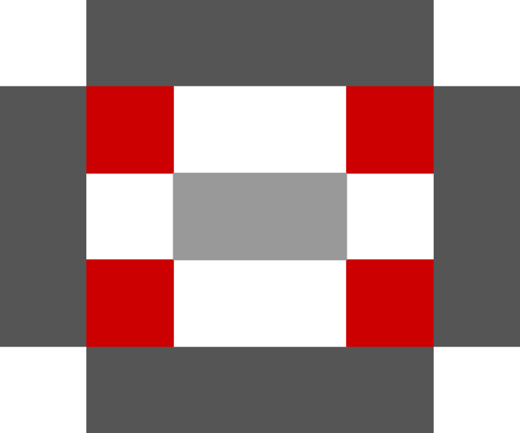
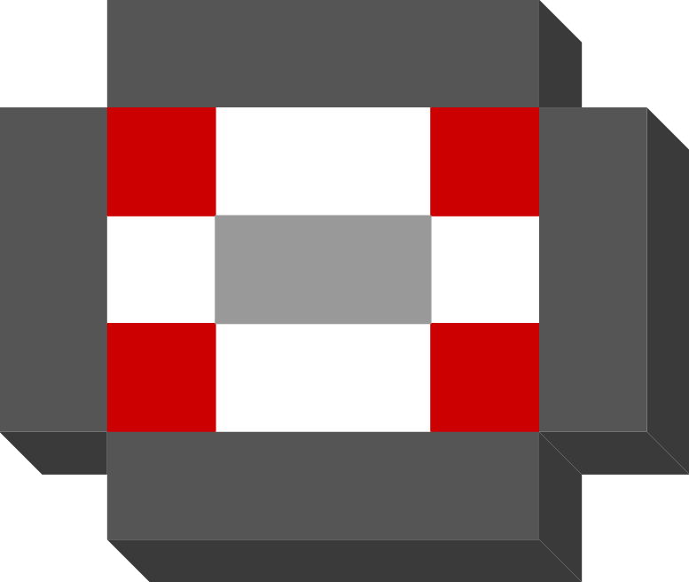
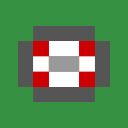
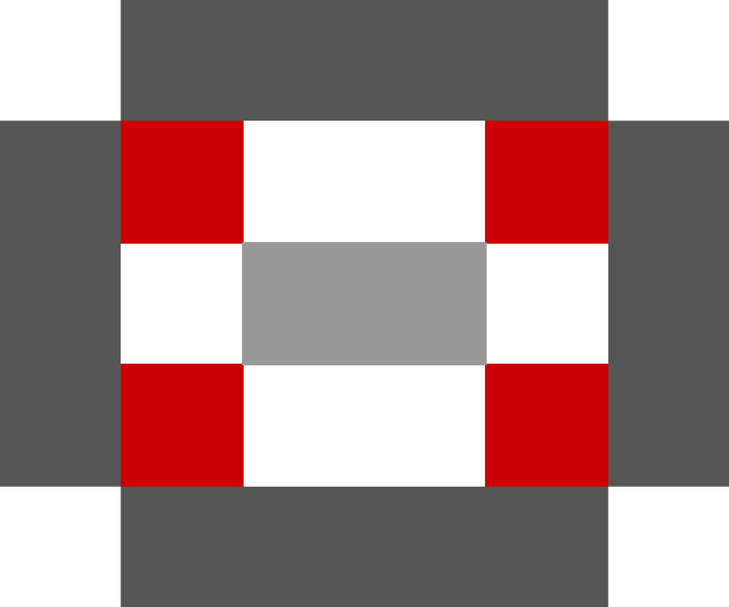
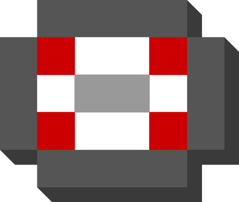
The ball is 8 pixels wide by 5 pixels tall, scaled by 2.2. It has a white body, red side panels, dark outline, and a grey center seam.
#fff, Red panels #cc0000, Outline #555, Seam #999Crowd members are 8 × 9 pixels with animated arms that wave based on match excitement. About 85% wear home team colours.
#1e5f2a, diagonal offset) on buttons, cards, and bar titles — never translucent drop shadowsrgba drop shadows in-game — solid extrusions onlyEvery backdrop in the game is a scene, drawn in code rather than shipped as art. There are no backdrop images left: thirteen ids in a day and a night pair used to be 26 webp files, 4.6 MB and about 42% of the app payload. Drawing them costs kilobytes, needs no decode, and gives each one an OVERCAST state the images never had — a pair can only be day or night, so a match in the rain used to show a blue sky behind the weather.
The same scene appears at two distances, which is what the two lines under each one mean. A ground has no room for the deep crowd bank a stadium draws, so the space above its terracing is filled with a scene close up, the field just beyond the touchline. Every larger venue shows one far away instead, on the horizon behind the stands, reached through a backdrop id: TEAM_SKYLINE gives a team an id, and SKYLINE_SCENE says which scene that id draws.
Almost every ground and mid venue draws the treeline, set one nation at a time rather than by a rule. A small venue shows its backdrop behind a shallow stand for the whole match, in a strip about a hundred pixels deep, and a specific landscape does not survive that — a town at that size is a smudge, and urban-town, the least built-up of them, drew nothing but sky. The treeline reads as somewhere at any height, which is what it was drawn to be. They are all written as the treeline in the table, so any one can be moved off it: twelve venues show trees-city, a city rising behind the same wood; Austria takes the European terrace; Dunmore and Monaco the riviera; Atlantis and Bermuda the empty coast; the Cook Islands, Fiji, Niue, Papua New Guinea, Samoa, the Solomons, Tonga and Wallis & Futuna the Pacific ridge; Algeria, Morocco, Namibia and Tunisia the high desert; Andorra, Georgia, Norway and Switzerland the Alps; Croatia, Greece, Malta and Portugal the hill town; Chile and seven of the career league's clubs the suburb; and Electra, Singapore and Metropolitan stand in the street under the towers. A stadium shows no backdrop at all. Its stands fill the frame from the pitch to the top of the screen, and the one moment a skyline ever appeared there was the opening camera push-in, which was removed. The stadium entries on the cards below are a record of what each would draw rather than something you can see, and the README’s table shows a dash for them for that reason. The four urban density scenes were deleted outright on the same argument: every venue that asked for one was a stadium, so the whole family was art the game could not reach.
Two tables decide a backdrop and only one of them answers for any given venue. TEAM_SKYLINE answers at a mid venue and above, TEAM_GROUND_SCENE at a ground. This paragraph used to say the second was no longer read by the game, which was true for about a fortnight in August 2026 while the treeline was a rule rather than a table, and wrong by the time anyone read it. Because only one table answers, a disagreement between the two is invisible until a nation changes tier and then its backdrop silently moves continent. That has now happened once and been caught twice, so the build checks the two agree wherever both name a code.
The ids are kept rather than folded into the scene names, because several share one scene and the id carries meaning the scene name does not — college says what those four Newland clubs are, and would become an indistinguishable second european without it.
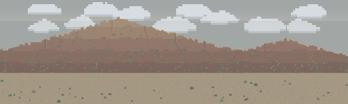
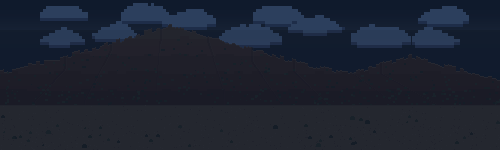
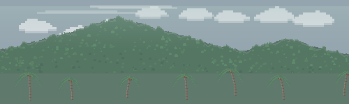
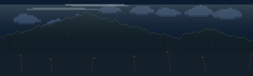
Every scene comes in three lights. Only the DAY set is authored; OVERCAST and NIGHT are derived from it by one transform — darken, and mix toward a single atmospheric colour — so eleven scenes and 302 colours under 109 names stay in step from one table instead of three. Sky, lit windows and haze are listed exceptions: a night sky is deep blue and an overcast one is nearly white, so the darkening rule would take it the wrong way, and a light that is ON gets brighter after dark. In play a venue picks OVERCAST in rain or snow and DAY otherwise. NIGHT is switched on at a mid venue and not at a ground, and the dividing line is the floodlights: pylons were added to the mid tier and draw only after dark, while a ground has none, so a dark sky over a pitch nothing is lighting would read as a mistake there.
riviera Mediterranean waterfront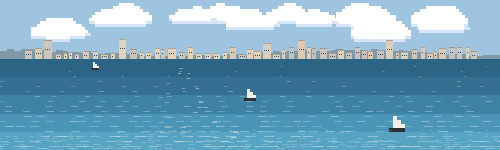
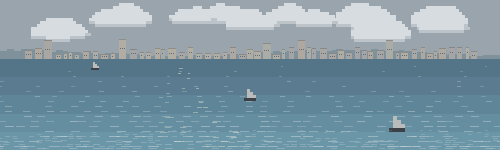
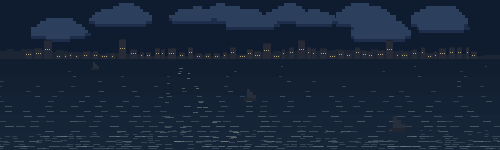
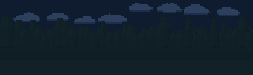
trees Treeline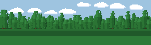
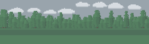
european Continental town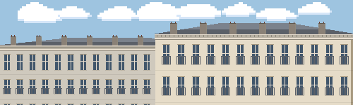
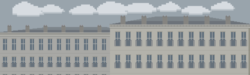
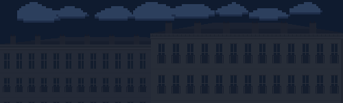
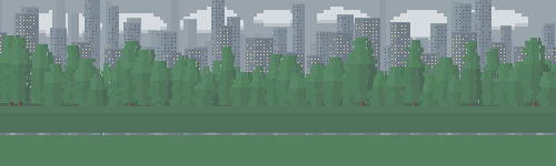
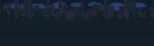
trees-city Treeline over a city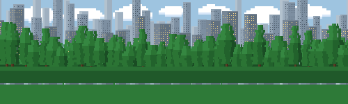
downtown Inner city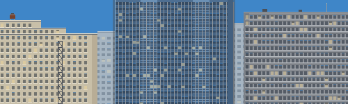
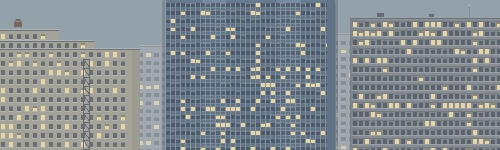
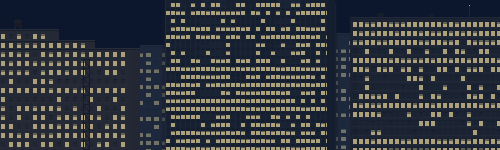
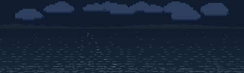
trees-city at a different distance, not at a higher density. That scene hazes its towers behind a wood so they read as a skyline over there; here the middle one is cropped by the top edge, because a hundred-pixel strip cannot both contain a tall building and say “tall”. The two beside it keep their crowns just inside the frame, so the picture says height and still says buildings. Three eras, not three copies: pre-war stone that sets back twice on the way up, with a water tank on the top step and a fire escape zigzagging down the front; a glass curtain wall whose mullions run unbroken across every floor slab; and post-war concrete hanging its floors out as bands with the glass set back in shadow behind them. One tower drawn three times in different colours reads as wallpaper however much detail is in it. Lit windows are biased by floor rather than rolled per window, because a floor is a tenant and a tenant is either in tonight or not; an evenly scattered facade is the one thing an office tower never is. Two hazed slabs sit behind the alleys so a gap between towers shows a building rather than daylight.coastal Empty coast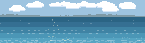
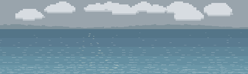
desert High desert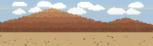
alpine The Alps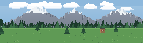
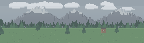
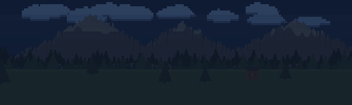
Math.max, with a coarse serration over them, gives the sawtooth skyline no single curve can. The snowline is broken by couloirs running below it and rock ribs standing above it, both from one noise field so they interlock: a ruler-straight snowline is the one thing that would give the whole scene away as a fill. A first cut sampled that noise every four pixels and produced a picket fence across every summit, so the period is long enough now that neighbouring columns agree. Two ranks of spruce below, a meadow, and one chalet whose roof oversails its walls to throw the snow clear.medhill Mediterranean hill town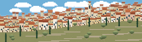
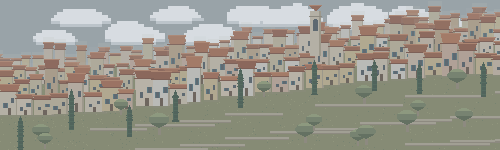
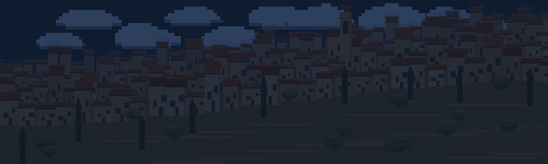
european, and it was rejected for being right. That scene’s first draft drew three ranks of packed terracotta roofs and the note against it read “a hill town in Italy, not a European club ground”: true about the address and wrong about the drawing. The rank system makes depth out of repetition, and repetition is exactly what a hill town is, the same small house a hundred times stepped up a slope. Three things carry it and the rest is filler. The cubes step, because a rank whose roofline climbs is a hillside and one that runs level is a street. The cypress is a near-black column two pixels wide, parallel-sided for four fifths of its height and then a point; move that threshold to a half and it is a poplar, and make it thicker and it is a saguaro, which is what the first cut drew. And one campanile clears everything, so the stack has a summit to climb toward. The ranks cascade down from the crest rather than sitting at fixed offsets either side of one line: a rank is a terrace at an altitude, not a layer at a depth, and the first version had houses scattered across the sky. Three later passes were about emptiness rather than error. The walls went from five near-identical off-whites to eight that include ochre and a faded pink, because a stack of one colour is one mass however varied the shapes in it are; a squared roll puts a few three-storey blocks among the singles, since the tall ones are what the eye reads a hill town’s silhouette from; and the bare slope below the town, a third of the frame, is now cut into dry-stone terraces with olives on them. The terraces do something the town cannot, which is run horizontally: every other line in the scene follows the hill, so a few level runs are what finally make the slope read as worked rather than as a green ramp. The olive is deliberately the cypress’s opposite, wide and low against tall and narrow, and the two together are what say Mediterranean where either alone just says tree.suburb The suburb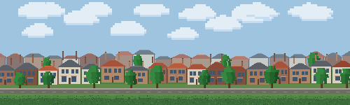
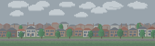
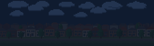
european. That scene is two four-storey Georgian facades across a street and the whole of it is the window grid. This one is the opposite in every respect that matters: the buildings are small, the windows are incidental, and what carries it is the roofline, a sawtooth of steep pitched gables with chimney stacks standing off it, legible at a size where no window would be. So the roof gets more of the building than a real one has. A pair is drawn as one block with one roof and a party wall, because that is what a semi is. Everything in it that repeats had to stop repeating. The pitch was cut from 0.62 of the wall to 0.42, since near-equilateral triangles on short boxes is a child’s drawing of a house; roughly half the pairs are now hipped rather than gabled, which breaks the sawtooth; the chimneys were thinned and about a third dropped, because two full stacks on every pair put a comb of verticals over a comb of gables; and the pair width and footing vary, since no amount of variation inside a unit survives that unit being stepped at a fixed interval. A church spire stood behind the row and came out again, and that is worth recording rather than deleting: nothing about it was drawn wrong, and a narrow grey vertical rising out of a row of houses is a factory stack with smoke off it before it is anything else. The pinnacles and clock face that would settle the question are two pixels each at this size, too small to arbitrate and big enough to look like soot. At a hundred pixels an object is its silhouette and nothing else, so a shape that collides with a commoner shape cannot be rescued by detail. The far rank is roofs and chimneys only, offset half a pair so its gables land in the near row’s gaps. The houses stood on nothing for a day. The scene painted sky, then two ranks of buildings, then jumped to the hedge at the bottom, leaving a band of open sky under every front door — and it was invisible in a full-height render because the trees and the hedge covered the gap. It appeared the moment a stand cropped the bottom away, which is the only view a player ever gets. There are front gardens, a road and a pavement under them now. The smoke gate that was supposed to catch this asked whether every row is covered, and every scene opens by filling its whole band with sky, so a scene that forgets its ground passes: covered is not the same as grounded, and it now checks both. Brick rather than the European terrace’s honey ashlar, because that is the difference you can actually see at this size.pacific High island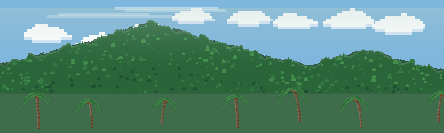
A strip of LED-style sponsor boards runs along the top touchline, in front of the crowd. Every board is a consistent 4:1 rectangle (height = board width / 4); boards tile the view at ~120 px wide in portrait and ~88 px on desktop, so they read identically on any screen. All boards show the same sponsor at once and rotate together in a synchronized vertical hard-roll (LED-ring style). Slots alternate brand → slogan → brand → second slogan; a sponsor with no slogan just shows its wordmark/logo on every slot. A sponsor can also carry a logos array of full-bleed board images that cycle by slot, so a campaign can alternate art across the strip (one entry repeats everywhere). Career-only sponsors (Bank of Newland and Newland Air) appear solely in career/league matches; every other board shows in all modes. Text is Press Start 2P, uppercased; image logos are pixelated in-game to match the art.
 Pixel Rugby